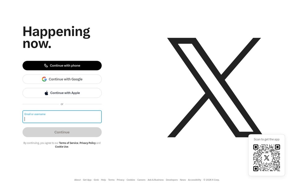
Headline and value
3/10"Happening now." announces that something is going on and refuses to say what.
The biggest words on the page are "Happening now." There is no line under them, so the page never names a topic, a person or a reason to stay. It's a news ticker with the news removed. Someone who already uses X fills in the blank from memory. A newcomer has nothing to go on, and nothing says why this beats the news app they already have.
Quick win: Replace "Happening now." with "See what people are saying about news, sports and the things you follow, live." and add one smaller line under it that says what you get after you sign up.
Call to action
5/10Five buttons, all called some version of "Continue", for something nobody has started yet.
The black "Continue with phone" button stands out and is easy to find, which is good. But it sits on top of "Continue with Google", "Continue with Apple", an email box and a greyed-out "Continue". That's five ways to say the same word, and none of them tells a newcomer whether this signs them up or logs them in. The faded grey "Continue" at the bottom looks broken until you type something, so the bottom of the stack ends on a button that seems to say no.
Quick win: Put a small label above the stack, such as "New here? Create your account in one click", and a separate "Already have an account? Log in" link under it, so each person knows which path is theirs.
Look and layout
5/10Clean and calm, but half the screen is spent on a logo everyone recognises.
The layout is tidy, the black-and-white look is sharp, and the left side reads easily from top to bottom. The right half, though, is one giant X that tells a visitor nothing they couldn't get from the browser tab. The "Scan to get the app" box sits right on the X's bottom-right foot, as if it were stepping on it, so the two compete for the same corner. Not one real post, picture or name appears anywhere on the screen, so the page looks empty for a place that claims something is happening right now.
Quick win: Shrink the X to a normal logo size in the top-left corner and fill the right half with three or four real posts on popular topics, so visitors can see what's inside.
Trust and proof
3/10The only number on the first screen is "© 2026".
There is nothing here to reassure a newcomer: no glimpse of who uses it, no well-known accounts, no sample posts, no hint of what joining costs. The only reassurance is the sign-in buttons for Google and Apple, which suggest a quick, familiar sign-up. The tiny legal line about "Terms of Service, Privacy Policy and Cookie Use" is the most detailed text on the page, which says more about the lawyers than about the product.
Quick win: Show a short row of real posts from well-known accounts on the right side, with names and profile pictures visible. That proves people are there and are talking right now.
Copy
4/10Two words on the computer, three on the phone, and they don't quite agree.
Desktop says "Happening now." and the phone says "See what's happening". Both are short, but they leave all the work to the visitor. Besides that, almost every word on the page is a button label or legal fine print, so the page never actually explains anything. The phone version is better because it at least tells you what you'll do ("see"), but it still doesn't say what you'll see.
Quick win: Use one headline on both computer and phone, and make it name what's inside: "See what people are saying about news, sports and the things you follow, live."
Mobile
5/10Easy to tap, but the whole pitch is "go somewhere else".
The buttons are big and easy to tap with a thumb, and "Get the app" with its blue glow is clearly the main step, with "Sign in" as a calmer second option. But the giant X takes up most of what the phone shows before anyone scrolls, and "See what's happening" sits under it with no hint of what's happening. The only route for a newcomer is to leave the page and install an app, and nothing on the screen says why they should bother. The Apple logo on "Get the app" may also make some visitors wonder if it's only for iPhones.
Quick win: Cut the X to about a third of its size, move the headline up, and add one line under it that names what's inside. Then add a small "or sign up here" link under "Get the app" for people who won't install anything yet.