Headline and value
7/10'Message privately' is clear and confident, but it's a command, not a reason.
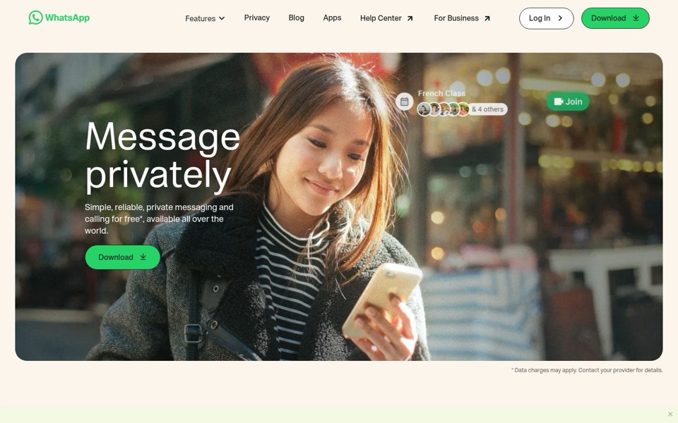
Two big words tell a stranger exactly what the app does, which beats most pages. But 'Message privately' reads like an instruction on a sign rather than a promise of what life looks like with the app. The line underneath does the real selling, 'Simple, reliable, private messaging and calling for free', yet it stacks four selling points into one breath and then hangs a star on the best one. Nothing on the first screen says why this instead of the texting app already on the visitor's phone, apart from the word 'private', which is never backed up.
Quick win: Rewrite the line under the headline as: 'Free messages and calls over Wi-Fi or your data plan, private and simple, anywhere in the world.'
Call to action
8/10One bright green 'Download' in the photo and one in the corner: clear, but there's a fake button in the scenery.
The green 'Download' button with the arrow is impossible to miss, and repeating it top right is sensible. The trouble is the 'Join' badge floating in the photo: same green, same rounded shape, same size as a real button, so some visitors will try to tap a picture. 'Log In' sits right next to the top 'Download' with almost equal weight, which is a lot of attention for something most first-time visitors can't use yet. The button also doesn't say it's free, the one word that would make clicking feel safe.
Quick win: Change the button label to 'Download free' and make the 'Join' badge in the photo semi-transparent or grey so it stops looking clickable.
Look and layout
8/10A warm, real-feeling photo and tons of calm space, with white text fighting a busy background.
The eye lands on 'Message privately', then the woman smiling at her phone, then the green button, which is exactly the right order. The cream background and rounded photo feel friendly, not techy. But the smaller white text under the headline sits on a blurry street full of bright spots and a striped top, so 'calling for free*, available all over the world' gets harder to read the further it goes. The 'French Class & 4 others' badge is a nice touch showing group calls, though it's so faint it looks like a reflection on the shop window.
Quick win: Add a soft dark fade behind the left side of the photo so the white text under the headline reads cleanly on every part of the image.
Trust and proof
6/10The page promises 'private' twice and proves it zero times on the first screen.
The brand name does a lot of the trust work here, but a first-time visitor sees 'privately' and 'private' with nothing to back them up. There are no numbers, no app-store ratings, no 'what private means' line, just a 'Privacy' link in the menu. The only small print on the screen is '* Data charges may apply. Contact your provider for details.', so the one piece of detail you chose to show is a warning. That's a lot like handing someone a free coffee with a receipt stapled to the lid. I can't see what's below the cut, so proof may live further down.
Quick win: Under the button, add a short line that links to the Privacy page, like 'See how we keep your chats private' instead of the data-charges footnote.
Copy
7/10Short and plain, but the line under the headline is a list of adjectives with a disclaimer attached.
'Simple, reliable, private' are three words every app says about itself, so they wash past the reader. 'Calling for free*' is the most exciting claim on the page and the star instantly turns it into a maybe. 'Available all over the world' is good, but it's buried at the end of the sentence and wraps onto a lonely 'world.' on its own line. On the phone, 'New! Call on WhatsApp Web' and 'Try it' are clear and nicely specific, which shows the page can be concrete when it wants to.
Quick win: Swap the three adjectives for what people actually do: 'Text, call and video chat one-on-one or in groups, free over Wi-Fi or your data plan.'
Mobile
7/10Big thumb-friendly button, but the next thing a phone user sees is a pitch for calling from a browser.
The green 'Download' button is large and easy to tap, and the round download icon at the top keeps it within reach after scrolling. The headline stays huge and readable, but the smaller white text runs straight across the striped top and bright background, so 'private messaging and' is hard to read on a small screen. Right after the photo, someone holding a phone is told 'New! Call on WhatsApp Web... right from your browser', a feature meant for a computer, with a small 'Try it' link that's a fiddly tap target. The 'Join' badge from the desktop is gone here, which proves the photo works fine without it.
Quick win: On phones, show a section about calling or group chats from the phone right after the photo, and move the 'Call on WhatsApp Web' block lower down.