Headline and value
7/10'Go anywhere' works because the form underneath does the explaining.
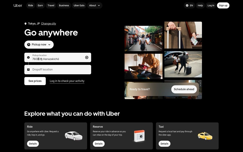
Two words, big and confident, and with the pickup and drop-off boxes right below, nobody wonders what 'Go anywhere' means. It still doesn't name a reason to choose this over hailing a cab, though, and there is no second line under the headline to give one. The page already knows the visitor is in 'Tokyo, JP' and has filled in their pickup spot, yet the headline stays generic. The headline says 'anywhere' while the page has quietly worked out exactly where you are.
Quick win: Use the city the page already shows. Change the headline to 'Go anywhere in Tokyo' and add one short line under it: 'Enter your pickup and drop-off to see prices for a ride or a local taxi.'
Call to action
8/10'See prices' is the right button, surrounded by a dozen white pills that look just like it.
'See prices' is honest and low pressure. It promises information, not a commitment, which suits someone just checking a fare. But it uses the same white rounded style as 'Pickup now', 'Sign up', 'Schedule ahead' and all three 'Details' buttons, so it doesn't stand out as the one to press. 'Log in to check your activity' sits right beside it and pulls returning users' eyes into the same spot. Meanwhile 'Schedule ahead' in the photos is a second main button doing a job the 'Pickup now' menu already does.
Quick win: Make 'See prices' the only button on the first screen with a filled, stronger look, remove the 'Schedule ahead' banner from the photos, and move 'Log in to check your activity' under the form in smaller text.
Look and layout
7/10Clean black layout, but the photo collage is mostly about bags.
The left side is excellent: big headline, two tidy boxes, one button, lots of breathing room, and the eye lands exactly where it should. The right side is five photos, and four of them show suitcases, packing or a map. Only one includes a car, and even there the people are walking away from it. The 'Ready to travel?' banner then covers the bottom two photos, so the collage reads more like an airline ad than a ride app.
Quick win: Swap one luggage photo for someone getting into a car or a Tokyo taxi, and remove the banner so the bottom two photos are fully visible.
Trust and proof
6/10The brand name is doing all the vouching, because nothing else on the first screen does.
Uber's name carries a lot, which is why this still works. But there are no ratings, no rider numbers and no line about prices being shown before you confirm. The 'Taxi' card ('Request a local taxi and pay through the Uber app') is a genuinely reassuring point for a Tokyo visitor, and it's hidden below the first screen. I can't see what's further down the page, so there may be proof there, but none of it is visible here.
Quick win: Add one short line right under 'See prices', such as 'You'll see the price before you book,' and bring the local taxi option up next to the form with a line like 'Prefer a local taxi? Book and pay in the same app.'
Copy
8/10Short, plain and clear, apart from a few spots where words are left with nothing to do.
'Pickup location', 'Dropoff location', 'See prices': no jargon, nothing to decode. The card text is plain too: 'Request a ride, hop in, and go' is about as clear as copy gets. The weak spots are 'Explore what you can do with Uber', a heading that could sit on any company's page, and the three identical 'Details' buttons, which tell you nothing about where they lead. 'Ready to travel?' asks a question the empty drop-off box was already asking.
Quick win: Rename the 'Details' buttons to say what they do: 'Request a ride', 'Reserve a ride', 'Book a local taxi'.