Headline and value
6/10The real promise is buried in line two of a four-line headline.
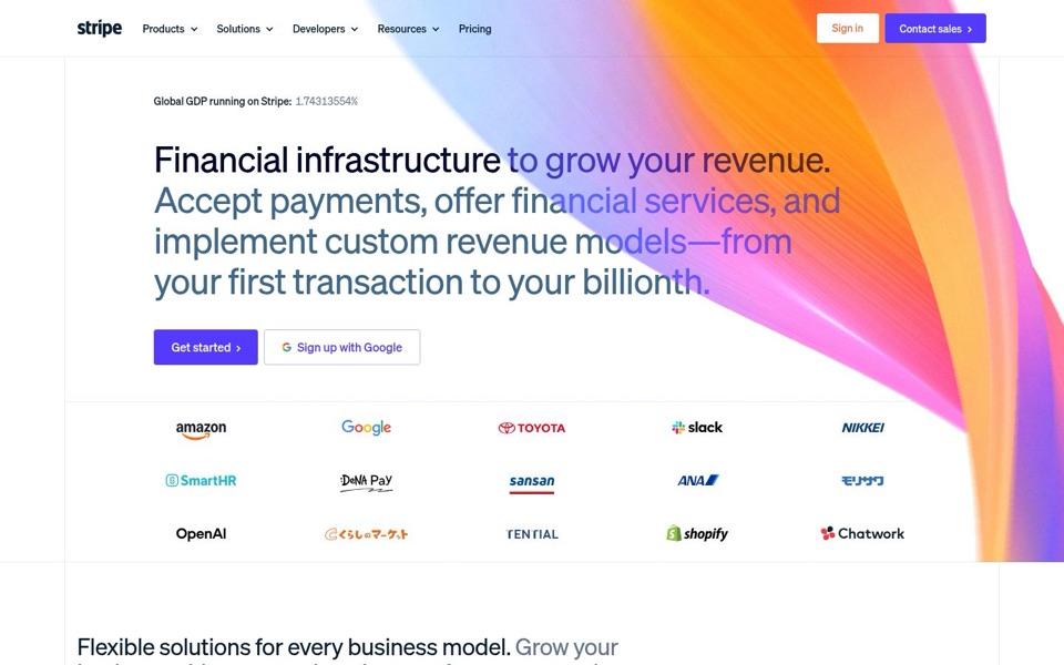
The first sentence, 'Financial infrastructure to grow your revenue.', is abstract: 'infrastructure' means nothing to a shop owner, and 'grow your revenue' is what every business tool promises. The clear part, 'Accept payments', only appears in the second sentence, set at the same giant size in a fainter blue-grey, so it reads like the headline kept talking after the full stop. The closing 'from your first transaction to your billionth' is the best line here because it says who it's for (everyone, at any size), but it sits at the end of the longest headline on the internet.
Quick win: Keep 'Financial infrastructure to grow your revenue.' as the big headline and move 'Accept payments, offer financial services, and implement custom revenue models—from your first transaction to your billionth.' into a smaller line underneath.
Call to action
7/10A good main button, but there are two filled purple buttons on one screen.
'Get started' is a solid filled purple button with 'Sign up with Google' as a quieter outlined option beside it. That's a sensible pairing. The trouble is 'Contact sales' in the top corner, which is the same filled purple, so the eye has two equally loud places to go. 'Get started' is also vague: started with what, an account, a setup guide, a sales call?
Quick win: Rename 'Get started' to 'Start accepting payments' and make 'Contact sales' an outlined button like 'Sign in', so only one filled purple button appears on the first screen.
Look and layout
7/10Beautiful swoosh, wrong side of the words.
The page is clean, well spaced and confident, and the colour swoosh gives it an instantly recognisable look. But the swoosh runs right through the headline: 'financial services, and', 'models—from' and 'billionth.' all sit on bright orange and pink, which makes them harder to read, like a highlighter that missed the line and coloured the whole paragraph. The GDP counter at the very top is small, grey and easy to miss, even though it's the most striking fact on the page.
Quick win: Move or crop the swoosh so it starts to the right of the longest headline line, and leave the words on plain white.
Trust and proof
9/10Fifteen logos and a live share of the world's economy. Hard to beat.
Amazon, Google, Toyota, Slack, OpenAI and Shopify right under the buttons tell a stranger this is safe before they've finished reading. 'Global GDP running on Stripe: 1.74313554%' is a terrific claim, but eight decimal places make it read like a science instrument rather than a boast, and the grey number is faint. Many of the logos (モリサワ, くらしのマーケット, TENTIAL, sansan) will only be recognised by visitors in Japan, so if this version is shown elsewhere, part of the wall is wasted. Pricing only appears as a word in the menu.
Quick win: Make the counter read in plain words and darker type, for example 'About 1.7% of the world's GDP runs on Stripe', and keep the live ticking number beside it if you like the effect.
Copy
6/10Confident and short on fluff, but written for finance people first.
'Financial infrastructure', 'offer financial services' and 'implement custom revenue models' are the vocabulary of a finance team, not of someone who wants to sell things online. The plain words, 'Accept payments' and 'your first transaction', are there but sit in the middle of a long sentence. The next section, 'Flexible solutions for every business model', repeats the same vague promise in different words.
Quick win: Lead the smaller line under the headline with the plainest verbs: 'Accept payments, offer financial services and build custom pricing, from your first sale to your billionth.'
Mobile
7/10The phone version took the free advice, then lost the part that explains the product.
On the phone the headline is already cut to 'Financial infrastructure to grow your revenue.', but the 'Accept payments' sentence is gone entirely, so a phone visitor never reads what Stripe actually does. The buttons are big, full width and easy to tap with a thumb, which is great. The swoosh still cuts across 'infrastructure' and 'revenue', there's a large empty gap below the buttons, and the fifteen logos stack into five rows, so it takes a lot of scrolling to get past them.
Quick win: Add one short line under the phone headline, 'Accept payments online, from your first sale to your billionth.', and fill the empty gap with it.