Headline and value
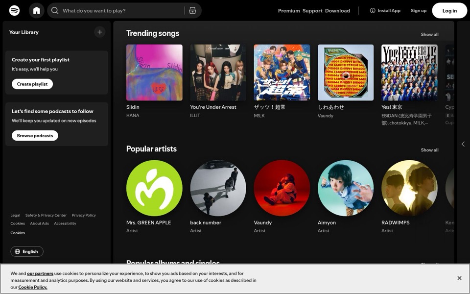
4/10On desktop, the biggest words on the first screen are 'Trending songs'.
Nothing at the top says what this is, who it's for, or why to pick it over the radio or another music app. The only sentence that sounds like a promise is the grey search box text, 'What do you want to play?', which asks a question instead of answering one. The phone version has a real pitch, 'Listen without limits. Try 1 month of Premium Individual for SGD 0.', so the words already exist. Desktop just doesn't use them. Right now Vaundy, who shows up twice on one screen, is doing more selling than the page is.
Quick win: Above 'Trending songs' on desktop, add one bold line taken from the phone page: 'Listen without limits. Try 1 month of Premium for SGD 0.'
Call to action
4/10The loudest button on the page is for people who already have an account.
'Log in' is the only solid white button at the top, while 'Sign up' sits beside it as small plain text. That treats every visitor like a regular. The left panel adds 'Create playlist' and 'Browse podcasts', which suggest a library a new visitor doesn't have yet. There's no single obvious first step for a newcomer, plus four other top links ('Premium', 'Support', 'Download', 'Install App') pulling in different directions.
Quick win: Swap the styles: make 'Sign up free' the white pill button and turn 'Log in' into the quieter text link.
Look and layout
7/10Clean, dark, and full of good album art, but the cookie notice eats the bottom of the screen.
The album covers and round artist photos catch the eye straight away and make the page feel alive. The dark background and white text are easy to read. The empty left panel takes up a quarter of the width with two small grey boxes and a lot of black. The cookie notice covers the 'Popular albums and singles' row and uses more words than the whole rest of the first screen.
Quick win: Shrink the cookie notice to one short line with an 'OK' button so it stops covering the third row.
Trust and proof
6/10The charts quietly prove there's real music here, but price and 'free' are missing on desktop.
Real names like Mrs. GREEN APPLE, RADWIMPS, Aimyon and ILLIT show that the catalogue is current and local, which reassures people. What a cautious visitor wants to know on desktop is whether it costs anything, and the first screen never says. The phone page answers it clearly: 'Only SGD 11.98/month after. Cancel anytime.' That kind of plain price-and-exit line builds trust, and desktop leaves it out.
Quick win: Put 'SGD 0 for 1 month, then SGD 11.98/month. Cancel anytime.' under the new desktop headline.
Copy
5/10The few words there are friendly, but they talk to people who've already signed up.
'It's easy, we'll help you' and 'We'll keep you updated on new episodes' are warm and plain, which is good. They speak to someone already inside the app, not a stranger deciding whether to join. There's no jargon problem here. The problem is that there's almost no copy at all where the pitch should be, and the longest paragraph on the screen belongs to the cookie notice.
Quick win: Rewrite the left panel heading for logged-out visitors as 'Sign up to save songs and build your first playlist'.
Mobile
7/10The phone version actually makes the pitch that desktop forgets.
'Try 1 month for SGD 0' is a big green button that's easy to tap with a thumb, and the price and 'Cancel anytime' sit right above it. That's clear and honest. Two snags: the top button says 'Open App', which assumes you already have it, and the cookie notice covers roughly the bottom fifth of the screen with large text. The offer card also has an X, so one tap removes the only explanation of what this is.
Quick win: Change the top button from 'Open App' to 'Get the app' for visitors who haven't installed it, and shorten the cookie notice to two lines.