Headline and value
5/10A headline about 'AI agents' on the homepage of the world's most famous chat app, which never says 'chat'.
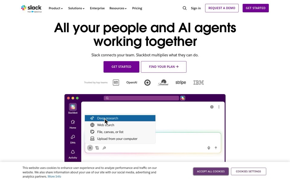
'All your people and AI agents working together' could open the page of almost any work tool, from a project board to an email client. The line under it, 'Slack connects your team. Slackbot multiplies what they can do.', uses two vague verbs, 'connects' and 'multiplies', where a plain noun would do the job. It never says how: messages, channels, files. Returning visitors fill in the gap from memory, but a newcomer is told who is in the room and never what the room is for.
Quick win: Replace the line under the headline with: 'Team chat and files in one place, with Slackbot built in to research, search and pull up what you need.'
Call to action
7/10The purple 'Get Started' is clear and bold. There are just a lot of buttons standing around it.
The solid purple 'GET STARTED' is the obvious first click, and pairing it with an outlined 'FIND YOUR PLAN →' is a sensible second choice. The top bar also carries its own 'GET STARTED', a boxed 'REQUEST A DEMO' and 'Sign in', so the first screen has five clickable invitations before the logos. 'Get Started' doesn't say what starts: a free trial, a new workspace, or a sales call.
Quick win: Remove the 'GET STARTED' from the top bar, turn 'REQUEST A DEMO' into a plain text link next to 'Sign in', and rename the main button 'Try Slack with your team'.
Look and layout
7/10Clean, confident and well spaced, and the demo window shows a menu instead of the product.
The huge black headline grabs the eye first, then the purple button, and the white space around them makes the page feel calm and expensive. The product window is the one picture on the page, and it shows a drop-down menu ('Deep research', 'Web search', 'File, canvas, or list') over an empty message box. For a chat app, there isn't a single chat message in view. Meanwhile the cookie banner sits across the bottom and cuts the window off at the knees.
Quick win: Swap the demo window for a short team conversation in which someone asks Slackbot a question and gets a useful answer in the thread, so chat and AI appear in one picture.
Trust and proof
8/10GM, OpenAI, Target, Paramount, Stripe and IBM: strong names, introduced in a whisper.
Few pages can line up names like these right under the buttons, and that does a lot of work. The label 'Trusted by top teams' is tiny pale grey text that most people will skip, and the logos are greyed out too, so the strongest proof on the page looks like small print. Pricing is only hinted at through 'FIND YOUR PLAN' and the 'Pricing' link, so a visitor can't tell whether there's a free way in. That's fine if it lives lower down, but I can't see it from here.
Quick win: Make the label as large as the line under the headline and give it more weight, for example 'Used by teams at OpenAI, Stripe, IBM and Target'.
Copy
6/10Short and polished, but it reads like a keynote slide instead of a description.
The wording is tight, and the first screen has almost no wasted words, which deserves credit. The trouble is that what little there is stays abstract. 'Working together', 'connects' and 'multiplies what they can do' are promises nobody can picture. The most concrete words on the page are buried inside the demo menu: 'Deep research', 'Web search', 'Upload from your computer'. That menu is the only place the page says what anything actually does.
Quick win: Lift two concrete verbs from the demo menu into the copy, for example 'Ask Slackbot to research a topic or find a file without leaving the conversation.'
Mobile
6/10Great thumb-sized buttons, and then the cookie banner eats the bottom third of the screen.
The full-width 'GET STARTED' and 'FIND YOUR PLAN' buttons are big, easy to hit and stacked in the right order, and the text is comfortably large. The headline breaks so that 'together' sits alone on its own line, which wastes space. The logo row loses its 'Trusted by top teams' label and cuts Stripe down to 'strip'. The cookie banner then takes up roughly a third of the screen with two more full-width buttons, so the demo window is mostly hidden before anyone scrolls.
Quick win: On phones, shrink the cookie notice to a slim bar at the bottom with one line of text and two small side-by-side buttons, and shorten the headline so it fits on two lines.