Headline and value
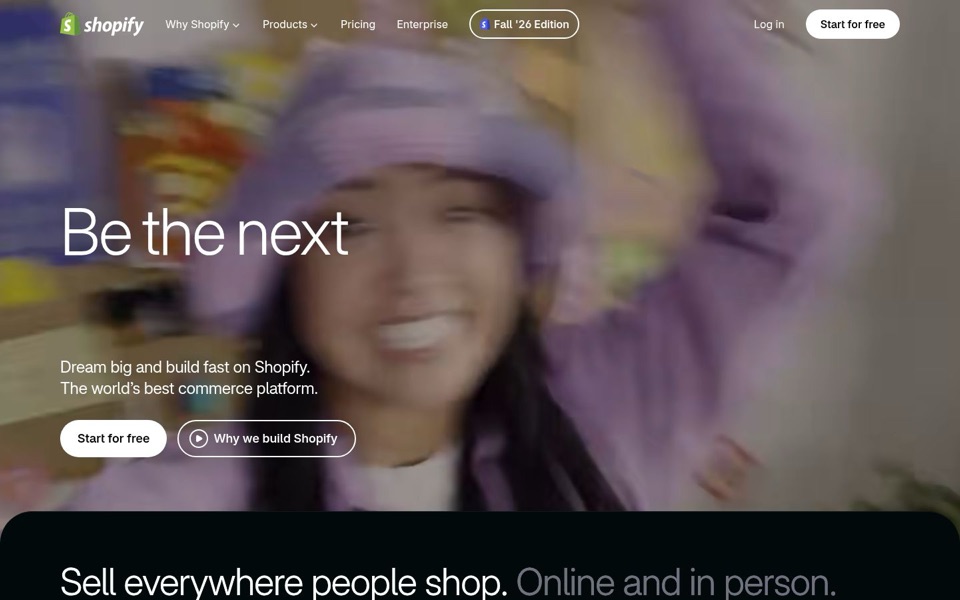
5/10On a laptop the big headline is a sentence with the ending missing.
The desktop screenshot shows only "Be the next" in huge letters. The phone shows the full line, "Be the next household name", so the ending is probably appearing in steps, and anyone who glances at the wrong moment gets a cliffhanger. Even complete, "household name" is a dream, not something you get, and the subheadline "Dream big and build fast" repeats the dreaming. The clearest promise on the page, "Sell everywhere people shop. Online and in person.", sits in the next section, where a quick visitor may never reach it.
Quick win: Make the full headline show from the first moment, with no words appearing one at a time, and put "Sell everywhere people shop" directly under it so the dream comes with an actual job.
Call to action
7/10The main button is clear. The second button is about you, not the visitor.
"Start for free" is a solid white button, the brightest thing on the first screen, and it appears again at the top right, so nobody hunts for it. The outlined second button, "Why we build Shopify", is a video about the company's reasons, which is a bit like a bakery offering a film about why it bakes instead of a taste. The "Fall '26 Edition" pill in the top menu also has a bright outline that pulls the eye away from the main button.
Quick win: Rename the second button to "See how it works" so it answers the visitor's question, and keep "Start for free" as the only filled button.
Look and layout
6/10The background photo is so blurred it looks like the shop is moving faster than the page.
Most of the first screen is a heavily motion-blurred photo, and with no clear subject a visitor can't tell what's being sold or built. The white text stays readable over it, and the font is clean and confident, so the basics are sound. The big headline and the subheadline sit far apart, with a wide empty gap where the missing headline words should go, which makes the screen look unfinished on a laptop.
Quick win: Replace the blurred photo with a sharp image of a real store, product or checkout so the picture shows what a visitor would be making.
Trust and proof
5/10"The world's best commerce platform" is announced, not shown.
The first screen makes the biggest claim possible, "The world's best commerce platform", with nothing beside it to back it up: no store names, no counts, no quotes from sellers. The Shopify name does a lot of the work for people who already know it, but a first-time seller sees a bold claim and a blurred photo. "Pricing" in the menu and "Start for free" are good signs about cost; I can't see any proof further down the page in this screenshot.
Quick win: Swap "The world's best commerce platform" for one real figure or a few well-known store names just under the buttons, for example "Trusted by [number] businesses".
Copy
5/10Lots of energy, very little information on the first screen.
"Be the next", "Dream big", "build fast" and "world's best" are all excitement and no detail; none of them says you'll get a shop, a checkout or a way to sell. "Commerce platform" is the only description, and it's a phrase a first-time seller may not use about themselves. The next section's "Online and in person. Across AI and on social. Locally and globally." is the most concrete, useful writing on the page and deserves the spotlight.
Quick win: Rewrite the subheadline in plain words, e.g. "Build your store fast and sell online, in person and on social."
Mobile
7/10The phone version actually finishes the headline and makes the buttons easy to tap.
On the phone, "Be the next household name" shows in full and the two full-width buttons are large, easy thumb targets with "Start for free" clearly filled in. The useful line "Sell everywhere people shop..." even peeks in before scrolling, so phone visitors get more meaning than laptop visitors. The photo is still blurry and the person is half hidden behind a hand, so the picture adds mood but nothing about shops, and the headline takes up nearly half the screen.
Quick win: Shrink the headline a little on phones so the "Sell everywhere people shop" line fits fully on the first screen without scrolling.