Headline and value
5/10A lovely life goal that never mentions what you do here.
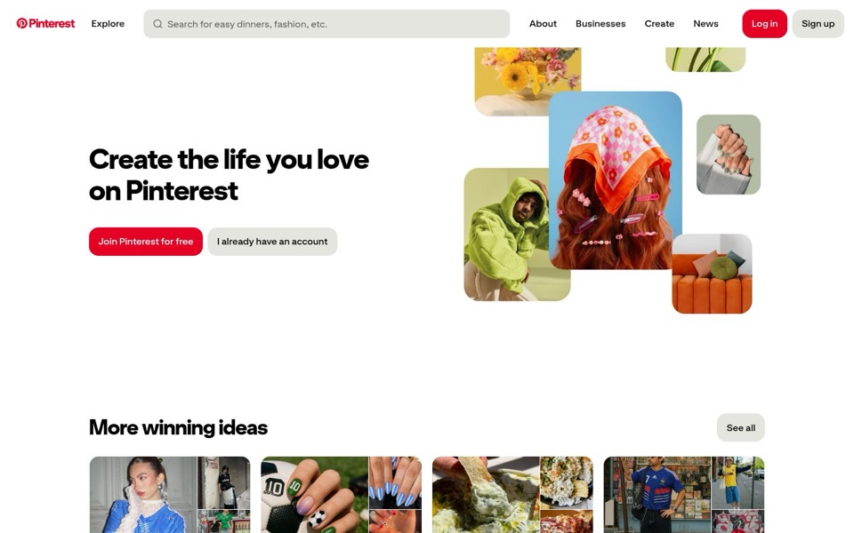
'Create the life you love on Pinterest' promises a feeling but no task. There's no hint of searching, saving or collecting ideas, so the visitor has to work it out from the pictures. The search bar's hint, 'Search for easy dinners, fashion, etc.', explains the product better than the headline does. There's no line under the headline at all, so nothing says why this beats scrolling a feed or saving screenshots. It's a headline that could hang over the orange sofa as a framed print.
Quick win: Add one plain line under the headline: 'Find and save ideas for dinners, outfits and home projects, free.'
Call to action
7/10The main button is clear, but the menu keeps shouting over it.
'Join Pinterest for free' is plain, red and easy to spot, and 'free' takes away the first worry. 'I already have an account' sits politely next to it in grey, which is right. The trouble is up top: the menu repeats 'Log in' and 'Sign up', and on the computer screen 'Log in' is the red one while 'Sign up' is grey. That's the opposite of the big buttons below, so red means 'join' in one spot and 'log in' in another.
Quick win: Remove 'Log in' and 'Sign up' from the menu on this screen. If they must stay, make 'Sign up' the red one to match 'Join Pinterest for free'.
Look and layout
8/10The picture collage carries the page, and it knows it.
The eye goes straight to the headscarf with the pink hair clips, then the lime hoodie, the nails and the orange sofa, and together they say 'style, beauty, home' faster than any sentence. The bold headline is easy to read and the two buttons sit neatly under it. The weak spot is the big empty white band between the first screen and 'More winning ideas', which pushes the real ideas down where some visitors won't reach them. The pictures also carry no labels, so they look like decoration rather than examples of what you'd find.
Quick win: Close the empty gap so the 'More winning ideas' row starts higher and peeks into the first screen.
Trust and proof
5/10The brand is famous, but this screen doesn't prove anything on its own.
There are no reviews, no numbers of people using it, and no quotes from anyone. The only proof is the 'More winning ideas' row, which shows real ideas like soccer-ball nails and a crisp with dip, and that's good proof, but it's mostly below the first screen. 'Free' on the main button helps a lot. A first-time visitor who somehow doesn't know the name gets pretty pictures and no reason to believe other people use it.
Quick win: Add one short line under the buttons such as 'Join [your number] people saving ideas every month', or move the real idea cards up so they're visible before scrolling.
Copy
6/10Very few words, and the best ones are hiding in the search bar.
The page has almost no text, which keeps it calm and clean. But the words it does use are vague: 'Create the life you love' could sit on a gym, a bank or a candle shop. 'More winning ideas' is a nice heading, though 'winning' is odd when nobody has said what the ideas are for. The search bar hint, 'easy dinners, fashion, etc.', is the most useful sentence on the page and it's in light grey.
Quick win: Borrow the search bar's words for the page: change 'More winning ideas' to 'Popular ideas right now: dinners, outfits, nails and home'.
Mobile
6/10Clear buttons, too many of them, and a pop-up speaking another language.
The buttons are wide, tall and easy to hit with a thumb, and the headline is big and readable. But the collage takes the whole top half, so the headline only shows up halfway down. Then there are five ways to join: 'Sign up' in the menu, 'Continue with email', 'Continue with Google', and a Google pop-up at the bottom reading '透過 Google 登入 Pinterest' (Sign in to Pinterest with Google) with '繼續' (Continue). That pop-up covers the small print and repeats the 'Continue with Google' button right above it, like a second waiter asking if you've ordered.
Quick win: Stop the Google pop-up from appearing on this screen, since 'Continue with Google' is already right there, and shrink the collage so the headline sits higher.