Headline and value
4/10The biggest words on the page are a name, and the promise under it fits any software company on earth.
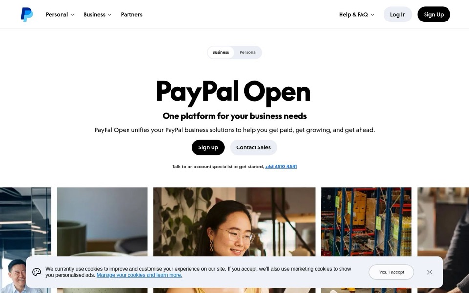
'PayPal Open' is huge, but a name tells a stranger nothing about what changes for them. The line under it, 'One platform for your business needs', could sit on an accounting app, a bank or a printer brand. The only concrete clue, 'get paid', is buried in the small grey-black sentence, and 'unifies your PayPal business solutions' quietly assumes the visitor already has several PayPal business solutions to unify.
Quick win: Make 'PayPal Open' a small label above the headline and use the big line for the outcome: 'Get paid and grow your business from one PayPal account'.
Call to action
6/10The black 'Sign Up' button is easy to find; it's just one of five ways out.
The main black 'Sign Up' button stands out well against the pale grey 'Contact Sales', and it's well placed under the text. But the first screen also offers a second 'Sign Up' and 'Log In' in the top corner, plus the phone number '+65 6510 4541' right under the buttons. 'Sign Up' also doesn't say what you're signing up for, which matters when the name above it is new.
Quick win: Change the main button to 'Open a business account' so it repeats the 'Open' idea and says exactly what happens next.
Look and layout
7/10Clean, calm and roomy, until the cookie notice parks on top of the photos.
The eye goes straight to the giant 'PayPal Open', then down the centre to the buttons, which is an easy path to follow. Lots of white space and one bold font make it feel confident. The photo strip (an office, a cup, a smiling woman, warehouse shelves) is a nice hint at 'all kinds of businesses', but the cookie notice covers the lower half of it, and the small 'Business / Personal' switch repeats the 'Personal' and 'Business' menus right above it.
Quick win: Shrink the cookie notice to a slim bar at the very bottom and remove the 'Business / Personal' switch, since the menu already does that job.
Trust and proof
6/10The PayPal logo is doing all the trust work, and luckily it's a strong logo.
Everyone knows PayPal, so the brand alone earns a lot of goodwill. A real phone number for 'an account specialist' is a genuinely reassuring touch. But the first screen shows no hint of what it costs, how many businesses use it, or a single customer saying it helped. For a brand-new name like 'PayPal Open', a stranger wants proof this isn't just a rebrand.
Quick win: Add one short line under the buttons with a real fact, such as 'Used by [number] businesses' or how fees work.
Copy
4/10Three 'get's in a row and none of them say how.
'Get paid, get growing, and get ahead' has rhythm, but 'get growing' sounds like a garden centre slogan and 'get ahead' is something every product promises. 'Unifies your PayPal business solutions' is company-speak; no business owner describes their week as having 'solutions'. The words that would help most, what's actually included in 'one platform', aren't on the first screen at all.
Quick win: Replace the sentence with plain words: 'PayPal Open brings your PayPal business tools together, so getting paid and growing happen in one place.'
Mobile
6/10Big, thumb-friendly buttons, then the cookie notice eats the bottom third of the screen.
On the phone, 'Sign Up' and 'Contact Sales' are large and easy to tap, and the phone number is tappable, which is great on a phone. The headline and sentence stack neatly. But the cookie panel covers nearly all of the photos, and the space between the phone number and the photos is empty, so before scrolling a visitor sees a name, a vague promise and a cookie notice.
Quick win: Make the phone cookie notice a short two-line bar with 'Yes, I accept' beside the text instead of below it.