Headline and value
5/10A friendly question where a promise should be.
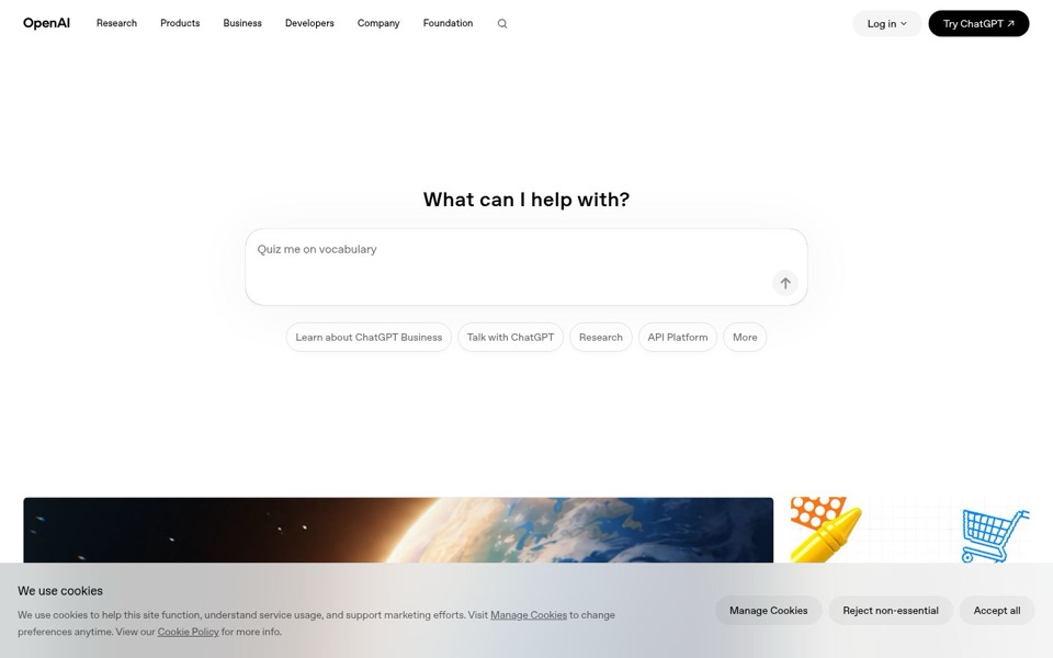
'What can I help with?' is warm, but it never says who 'I' is, what it can actually do, or why you'd pick it over anything else. The only real hint is the grey example text 'Quiz me on vocabulary', so a newcomer's first lesson is that this is a vocabulary quiz. People who already know OpenAI will be fine. Everyone else is being interviewed by a stranger who hasn't introduced themselves.
Quick win: Add one plain line under the headline: 'OpenAI makes ChatGPT and tools for building with AI. Type a question to try it.'
Call to action
5/10Two ways to start, and neither one says 'start here'.
The black 'Try ChatGPT' button in the top corner is the clearest thing to click, but its little arrow suggests it sends you off this page, and it sits far from the middle where the eye lands. The chat box in the center is the real invitation, yet its only button is a pale grey up arrow. Five pill buttons underneath ('Learn about ChatGPT Business', 'Talk with ChatGPT', 'Research', 'API Platform', 'More') split attention between very different visitors. The cookie bar gets three labelled buttons; the actual product gets an unlabelled arrow.
Quick win: Give the send button inside the chat box words and color, for example a dark button reading 'Ask ChatGPT', so the center of the page has one obvious next step.
Look and layout
7/10Calm, clean, and starting about a third of the way down.
The look is tidy: one clear font, plenty of breathing room, a simple chat box that is easy to read. But a tall band of empty white sits between the menu and the headline, which pushes the colorful pictures (the Earth from space, the yellow crayon, the shopping cart) down behind the cookie bar. Those pictures are the most inviting things here and a visitor barely sees them. The whole planet is waiting just below, politely queuing behind a cookie notice.
Quick win: Cut the empty space above 'What can I help with?' by roughly half so the chat box sits higher and the top of the pictures shows before anyone scrolls.
Trust and proof
4/10Leaning entirely on the name in the corner.
On the first screen there is no review, no customer name, no usage number and no hint of price; the only reassurance is the 'OpenAI' logo. That works for people who already know the brand, but a newcomer gets nothing that says others rely on this. I can't see what's below the cookie bar, so there may be proof further down, but it isn't doing any work on the first screen.
Quick win: Add one small line under the chat box with a real figure you can stand behind, for example 'Used by [your number] people every week'.
Copy
6/10Very few words, and a couple of them are insider talk.
There's almost nothing to read, which keeps things light, and 'Talk with ChatGPT' is nicely plain. But 'API Platform' means nothing to most people, and 'Research' alone could be a button, a topic or a department. The cookie notice is the longest piece of writing on the screen, so the most-read text on the page is about tracking, not about the product.
Quick win: Rename 'API Platform' to 'Build apps with our API' and 'Research' to 'Read our research' so every button says what happens when you click it.
Mobile
5/10On a phone, the cookie bar wins the first screen.
The grey cookie bar covers roughly the bottom 40% of the screen, and its three full-width buttons ('Manage Cookies', 'Reject non-essential', 'Accept all') are the biggest, easiest things to tap. The 'Try ChatGPT' button from the desktop is gone; the top shows only the logo, a search icon and a menu icon. The pill buttons stack into three rows with 'Learn about ChatGPT Business' first, so the business pitch outranks talking to ChatGPT. On the plus side, the headline is big and the chat box is easy to tap with a thumb.
Quick win: Shrink the phone cookie bar to one short line with 'Accept all' and 'Manage' side by side, and put a 'Try ChatGPT' button in the top bar next to the search icon.