Headline and value
6/10A huge, confident headline that sells a mood rather than a product.
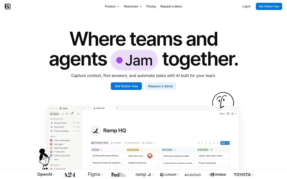
'Where teams and agents Jam together.' is big and memorable, but 'agents' is never explained, and 'Jam' makes it sound like a band rehearsal. On the phone the word swaps to 'Ship', so two visitors read two different promises. The line underneath, 'Capture context, find answers, and automate tasks with AI built for your team', would fit almost any AI tool on the market. Nowhere on the first screen do the words docs, notes, wiki or projects appear, so the one thing that makes this different never gets said.
Quick win: Keep the big headline and rewrite the line under it to name the thing: 'Docs, wikis and project boards in one place, with AI agents that answer questions, route tasks and write reports for your team.'
Call to action
8/10One loud blue button, one polite backup. Exactly right.
'Get Notion free' is solid blue, sits right under the promise, and says both the action and the price. 'Request a demo' is pale enough that it never competes, which is correct. The only clutter is that 'Get Notion free' and 'Request a demo' each appear twice on the first screen (menu and middle), so the top bar repeats what the middle already says. 'Get Notion free' tells me the price but not what I'll actually have after clicking.
Quick win: Make the main button say what you get, not just the brand name: 'Start your free workspace'.
Look and layout
8/10Clean and calm, but the product picture gets squeezed by the logo strip.
The eye goes to the giant headline, then the purple 'Jam' pill, then the blue button. That's a perfect order. The product picture of 'Ramp HQ' is a smart choice, but its words are tiny ('Review performance metrics' is barely readable), and the logo strip slices off the bottom of the task board. The doodle peeking over the top right corner is charming, though he does look like he's still waiting for someone to explain the agents to him.
Quick win: Raise the product picture or push the logo strip below it, and zoom into one readable part, such as the agent list ('Q&A agent', 'Reporting agent'), so visitors can actually read what the AI does.
Trust and proof
9/10OpenAI, NVIDIA, FedEx and Toyota on the first screen. Few pages can say that.
The logo strip is about as strong as proof gets, and the product picture shows a real company setup ('Ramp HQ'), which quietly adds more. On desktop, though, the logos sit there with no line explaining them. The phone version has 'The most ambitious companies run on Notion.' and the desktop doesn't. A 'Pricing' link in the menu helps too. No user count or review rating shows before anyone scrolls, but with these names that's a small gap.
Quick win: Add the phone's own line above the desktop logos: 'The most ambitious companies run on Notion.'
Copy
7/10Short and tidy, but it leans on fuzzy words like 'context' and 'agents'.
There are no wasted words, which is rare. But 'Capture context' is office-speak that a newcomer has to translate, and 'agents' is doing a lot of work without ever being explained. The screenshot explains it better than the words do: 'Task routing agent', 'Q&A agent', 'IT help desk'. The copy is shy about the plain facts the picture shows off.
Quick win: Swap 'Capture context, find answers' for things a person actually does: 'Write docs, answer questions, and hand routine tasks to AI agents'.
Mobile
8/10Big tappable buttons, but the phone never shows the product.
Both buttons stretch full width and are easy to hit with a thumb, and the text is large and readable. The row of seven doodle faces replaces the product picture, so a phone visitor sees faces, a headline and buttons, but never sees what Notion looks like. There's a big empty gap between 'Request a demo' and the logo line, and the logo row is cut off at both edges ('remote' fades into half a word).
Quick win: Shrink the gap under the buttons and slot in a small cropped view of the agent list or task board where the doodle faces now sit.