Headline and value
8/10Clear and confident, but 'and more' is a shrug in the middle of a strong promise.
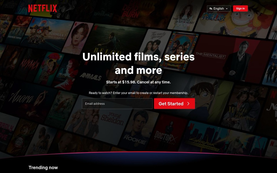
'Unlimited films, series and more' tells a stranger exactly what this is in one breath, and 'Unlimited' is a real reason to pick this over renting one film at a time. The weak spot is 'and more': the wall of posters behind it is showing far more than those two words ever say. The line under it, 'Starts at $15.98. Cancel at any time.', does the heavy lifting on price and risk, which is smart, but 'Starts at' hints at a cheaper or pricier plan without saying what you get for that starting price.
Quick win: Replace 'and more' with the actual extra you offer, or drop it: 'Unlimited films and series' is cleaner than a promise nobody can picture.
Call to action
8/10One email box, one red button, and the button wins the room.
The red 'Get Started' button is the brightest thing on the first screen and sits right beside the email box, so the next step is obvious. The line above it, 'Enter your email to create or restart your membership', quietly handles both new and returning visitors, which is a clever bit of welcoming back the ones who left. The only rival is the top-right 'Sign In' button, painted the same red, so the eye briefly has two red things to choose between. 'Get Started' is also vague about what happens after you hand over your email.
Quick win: Make the top-right 'Sign In' button an outline or white text so the only solid red button on the screen is 'Get Started'.
Look and layout
9/10A tilted wall of posters that sells the catalogue without saying a word.
The darkened, angled grid of real titles (Stranger Things, One Piece, Young Sheldon, The Rookie) shows the product instead of describing it, and the dark tint keeps the white headline easy to read. Everything important sits in one centred column, so the eye goes headline, price, email box, button in that order. The curved red line at the bottom neatly hands you to 'Trending now'. The trade-off is that the posters are so dim that most titles turn into a pleasant blur, like a shelf of DVDs seen with the lights off.
Quick win: Lighten the poster wall slightly at the edges, away from the headline, so a few recognisable titles can be read at a glance without hurting the text in the middle.
Trust and proof
8/10The brand and the posters do the vouching; the price detail is what's missing.
Recognisable shows on the wall work as proof that the catalogue is real, and 'Cancel at any time' removes the biggest worry about signing up. A big name like this doesn't need reviews on the first screen. What's missing is clarity on the money: 'Starts at $15.98' doesn't say what that buys, how often it's charged, or what the next tier adds, and people hesitate to hand over an email when the price feels like it has fine print.
Quick win: Put one short line of detail beside the price, such as the plan name and what it includes, so 'Starts at $15.98' reads as a complete offer.
Copy
8/10Short, plain, and nearly jargon-free, with two small soft spots.
Every line on the first screen earns its place: what it is, what it costs, that you can leave, and what to do next. 'Ready to watch?' is friendly and gets straight to the point. The soft spots are 'and more', which says nothing, and 'Starts at', which raises a question it doesn't answer. Small detail: desktop says 'Cancel at any time' while the phone says 'Cancel anytime' and 'movies, TV shows' instead of 'films, series', which is fine if those are deliberate regional versions but worth checking.
Quick win: Rewrite the price line to finish the thought: 'Starts at $15.98 for [plan name]. Cancel at any time.'
Mobile
8/10Stacks in the right order and the button is thumb-friendly, but it's narrower than its own email box.
On the phone the headline, price, email box and 'Get Started' stack top to bottom in the right order, and the text is large enough to read without zooming. The 'Get Started' button is big and easy to tap, but it's noticeably narrower than the full-width email box above it, so the box looks more important than the button. The language button shrinks to just an icon, which some visitors won't recognise, and the 'Trending Now' numbered posters are a nice bonus that hint there's more to scroll for.
Quick win: Make 'Get Started' the same full width as the email box on phones so the button feels like the main event and is easier to hit with a thumb.