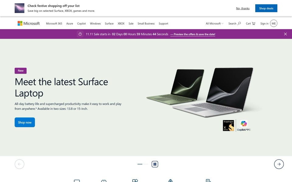
Headline and value
5/10'Meet the latest Surface Laptop' is an introduction, not a reason to buy.
The big headline tells me what it is but not why I'd want it. The actual selling points, 'All-day battery life' and 'Available in two sizes: 13.8 or 15-inch', sit in smaller text underneath, and 'supercharged productivity' is too vague to picture. Nothing says why this laptop and not any other laptop on the same shelf. The headline is a handshake at a party; the battery life is the interesting thing you'd actually say next.
Quick win: Move the battery promise into the headline: 'All-day battery, in 13.8 or 15-inch'. Keep 'New' as the small purple tag above it.
Call to action
6/10'Shop now' is clear, but it has a twin at the top of the page.
'Shop now' is solid blue, easy to spot and sits right under the text, which is good. But the top strip has a 'Shop deals' button in the exact same blue and shape, and it is seen first, so the laptop's button is the second blue button a visitor meets. There's also a 'Preview the offers & save the date!' link in the purple bar, making three different 'go shopping' invitations before anyone scrolls. 'Shop now' also gives no hint of price, so clicking feels like a leap.
Quick win: Put a short line next to the button such as 'From [price]', and change the top strip's 'Shop deals' to an outlined or text-style link so 'Shop now' is the only solid blue button.
Look and layout
6/10Beautiful laptop photo, squeezed under two sale banners.
The laptop picture is clean, the green and silver pair shows both sizes at a glance, and the pale green background gives the headline room to breathe. But the top 190 pixels are a white festive strip, the menu, and a loud purple countdown, so the eye bounces between 'Check festive shopping off your list' and '02 Days 00 Hours 59 Minutes' before it reaches the product. The Snapdragon X and Copilot+PC stamps under the laptop look like stickers on a fridge: noticed, not understood.
Quick win: Merge the festive strip and the purple countdown into one thin bar, and let the laptop section start higher on the screen.
Trust and proof
7/10The Microsoft logo does most of the trusting; the page adds little else.
The brand name carries a lot of weight, and the cart, sign-in and support links make it feel like a real store. But the first screen shows no price, no rating, no review count and no delivery or return promise. The asterisk on 'from anywhere.*' points to fine print that isn't visible here, which quietly undercuts the 'All-day battery life' claim. The chip and Copilot+PC badges are proof for people who already know what they mean.
Quick win: Add one short reassurance line under 'Shop now', such as free delivery or the return window, if you offer one, and make sure the asterisk's fine print is reachable in one tap.
Copy
5/10Clear enough, but leans on stock phrases like 'supercharged productivity'.
'All-day battery life' is concrete and useful; 'supercharged productivity' and 'work and play from anywhere' could be printed on any laptop box in the store. The top strip's 'Check festive shopping off your list' and 'Save big on selected Surface, XBOX, games and more' are friendly but generic, and 'more' is doing a lot of work. The best line on the page, the two sizes, is tucked at the very end of the paragraph.
Quick win: Swap 'supercharged productivity' for a plain fact the page already shows, for example: 'All-day battery life and a Snapdragon X chip, in 13.8 or 15-inch.'
Mobile
6/10Cleaner than desktop, but the chat bubble sits on top of a link.
On the phone the sale banners are gone, so the Surface Pro slide gets the whole screen, and the headline 'PC のパワーと、タブレットの持ち運びやすさ' (The power of a PC, with the portability of a tablet) is a genuinely good promise. The button '今すぐ購入する' (Buy now) is large and easy to hit with a thumb. However, the headline breaks in the middle of 'タブレット' (tablet), the paragraph runs five lines before the button, and the round blue chat button covers the 'Surface を…' (Surface…) link at the bottom. The slideshow also shows a different product than desktop, so what a visitor sees depends on when they arrive.
Quick win: Move the chat button up or make it smaller so it doesn't cover the 'Surface を…' (Surface…) link, and shorten the paragraph to two lines so the button rises on the screen.