Headline and value
4/10A warm welcome that never says what you'll get.
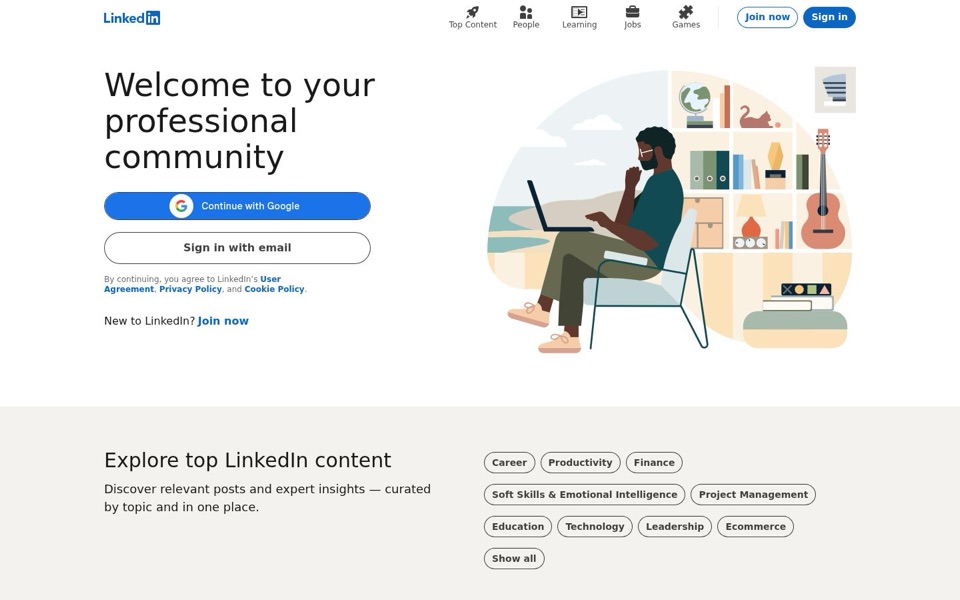
'Welcome to your professional community' is a greeting, not a promise. It doesn't mention jobs, hiring, learning or any of the things your own menu lists ('Jobs', 'People', 'Learning', 'Top Content'). There's no smaller line under it explaining the benefit, so a stranger has to arrive already knowing what LinkedIn does. The famous logo is doing all the work the headline should be doing.
Quick win: Replace the headline with one that names what visitors can do, built from your own menu: 'Find jobs, meet people and keep learning in your field.'
Call to action
5/10Three sign-up paths, and the clearest one is the smallest.
The loudest button, 'Continue with Google', apparently handles joining and signing in (the phone version's small print says 'By clicking Continue to join or sign in'), but the desktop page never says so. The second button, 'Sign in with email', tells newcomers outright that it isn't for them. The actual invitation, 'New to LinkedIn? Join now', is a text link under a block of legal small print. Meanwhile the top-right corner fills in 'Sign in' and leaves 'Join now' as a plain outline, so returning members win that spot too.
Quick win: Rename 'Sign in with email' to 'Continue with email' so both big buttons clearly work for new and returning visitors alike.
Look and layout
7/10Clean, calm and well spaced, with an illustration about a quiet afternoon off.
The layout is easy on the eyes: big headline on the left, two clear buttons, plenty of breathing room, and a friendly drawing on the right. The drawing, though, shows a man alone on a laptop next to a cat, a guitar and a globe, which feels more like a cozy weekend than a 'professional community'; it's the largest thing on the screen and it shows nobody else. The menu icons ('Top Content', 'People', 'Learning', 'Jobs', 'Games') are tidy but small and grey, so the best hints about what's inside are the easiest to miss.
Quick win: Swap the illustration for one showing what the site does, such as a job listing card, a short post or two people connecting, so the biggest picture explains the product.
Trust and proof
6/10The famous name carries everything; the page adds nothing.
LinkedIn gets away with this because nearly everyone has heard of it, so the logo works as its own badge of trust. But the first screen shows no numbers, no member examples and no hint of the jobs or posts waiting inside. The only reassurance on offer is the legal line about 'User Agreement, Privacy Policy, and Cookie Policy'. The topic buttons below ('Career', 'Finance', 'Leadership') are the first proof that there's real content here, and they only appear after scrolling.
Quick win: Add one short line under the headline showing scale or activity, such as 'Join [number] professionals sharing jobs and advice.'
Copy
5/10Short and polite, but it says the least it possibly could.
There's very little writing on the first screen, which keeps it clean, but almost none of it explains anything: a greeting, two button labels, legal text and 'New to LinkedIn?'. The best explaining sentence on the page, 'Discover relevant posts and expert insights curated by topic and in one place', sits in the second section where many visitors won't see it. The legal small print also differs between versions: desktop says 'By continuing', phone says 'By clicking Continue to join or sign in', and only the phone one explains what the button does.
Quick win: Use the clearer phone wording on desktop too: 'By clicking Continue to join or sign in, you agree to...' so people know the Google button works for new accounts.
Mobile
7/10Better than desktop, and it quietly fixes some of desktop's mistakes.
On the phone, the big buttons stretch nearly full width and are easy to hit with a thumb, the headline is large and centered, and the drawing moves below the buttons so the important parts appear before anyone scrolls. The top corner here fills in 'Join now' and leaves 'Sign in' as an outline, which is the opposite of desktop, and the phone gets it right. The same issues remain, though: 'Sign in with email' still turns newcomers away, and the headline still doesn't say what LinkedIn is for.
Quick win: Copy the phone's top-corner choice to desktop (filled 'Join now', outlined 'Sign in'), and rename 'Sign in with email' to 'Continue with email' here too.