Headline and value
5/10The best spot on the page goes to a slogan that could sell almost anything.
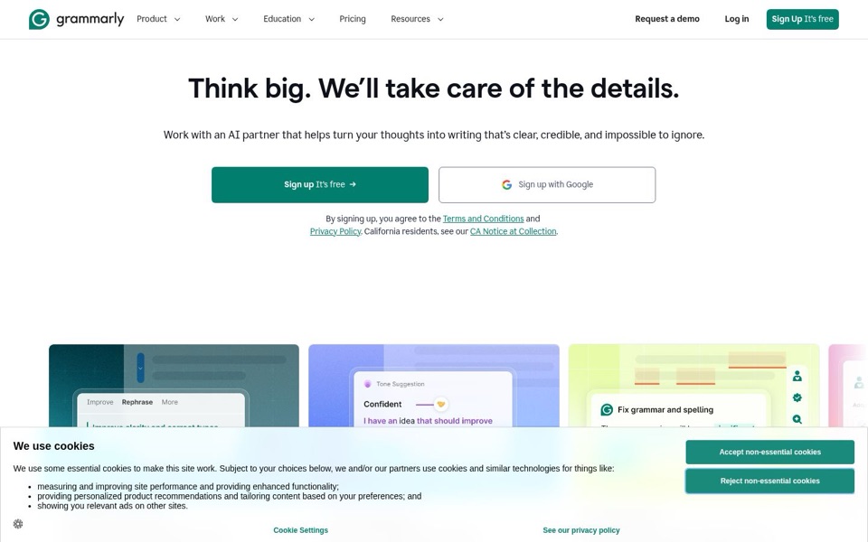
'Think big. We'll take care of the details.' works as a motivational poster, but it never mentions writing, grammar or what 'the details' are. The real promise sits in the smaller line: 'turn your thoughts into writing that's clear, credible, and impossible to ignore.' That line is good, so the page explains itself, just one line late. Nothing on the first screen says why this beats a free spell-checker or a general AI chatbot.
Quick win: Swap the order: make the big headline about writing, such as 'Write clearly and confidently, with an AI partner by your side', and move 'Think big. We'll take care of the details.' into a small line above it, or drop it.
Call to action
7/10One clear green button, two sign-up choices, and a paragraph of legal text underneath.
'Sign up It's free →' is bold, green, big, and repeated in the top right corner, so nobody has to look for it. 'Sign up with Google' sits next to it as an easy second choice, which is fine because both lead to the same place. The legal text below, with 'Terms and Conditions', 'Privacy Policy' and 'CA Notice at Collection', is three underlined links stuck to the buttons and pulls the eye away at the moment of decision. Up in the menu, 'Request a demo' and 'Log in' are fine, but bold 'Request a demo' competes a little with the main green button.
Quick win: Shrink the legal text to one lighter, smaller line like 'By signing up, you agree to our Terms and Privacy Policy', and change the button to say what happens next, for example 'Start writing better, free'.
Look and layout
6/10Clean, calm and centred, then a big empty gap right where the product should be.
The eye goes straight to the bold headline, then the green button, which is the right order, and the lots of white space makes it feel premium. The product pictures ('Rephrase', 'Tone Suggestion: Confident', 'Fix grammar and spelling') are the most convincing thing on the page, but they start far down after a large empty gap and then get cut off by the cookie notice. Right now the page shows a clean desk and keeps the actual work in the drawer.
Quick win: Close the empty gap so the product cards start right under the buttons, and make the first card a clear before-and-after sentence that is readable at a glance.
Trust and proof
4/10A famous brand that shows no proof before anyone scrolls.
The first screen has no reviews, star ratings, user counts, company logos or quotes, only the logo and legal links. The brand is well known, so returning visitors may not need convincing, but a stranger sees nothing to back up 'clear, credible, and impossible to ignore'. 'It's free' helps, and 'Pricing' is in the menu, which is a good sign. Any proof further down the page is hidden behind the empty gap and the cookie notice.
Quick win: Add one short proof line directly under the buttons, such as 'Trusted by [your number] people and teams', or a row of a few recognisable company logos if you have permission to show them.
Copy
6/10Polished words that say very little until the second sentence.
The tone is confident and friendly, and 'clear, credible, and impossible to ignore' is a strong promise. But 'Think big' and 'the details' are vague, and 'Work with an AI partner' sounds like every other AI product right now. The most concrete words on the page are on the small product cards: 'Fix grammar and spelling', 'Rephrase', 'Confident'. Those should be doing more of the talking.
Quick win: Rewrite the smaller line using the concrete tasks from the cards: 'Fix grammar and spelling, sound more confident, and rephrase clunky sentences, so your writing is clear, credible, and impossible to ignore.'
Mobile
5/10On a phone, the cookie notice takes over everything below the buttons.
The headline, smaller line and green 'Sign up It's free' button stack nicely, the text is easy to read and the buttons are wide and easy to tap with a thumb. Then the cookie notice covers more than the bottom third of the screen and cuts through the 'Sign up with Google' button. Its two big green buttons, 'Accept' and 'Reject non-essential cookies', look just as important as your own sign-up button. A phone visitor sees no product pictures at all before scrolling, and the large empty space above the headline pushes everything down.
Quick win: Make the phone cookie notice a slim bar at the bottom with smaller, plainer buttons, and cut the empty space above the headline so the first product card peeks onto the screen.