All roasts
google.com as our browser saw it on 3 Nov 2026
google.com, roasted on 3 Nov 2026.

Golden

One box, one job. Then a Chrome pop-up moved in next door.

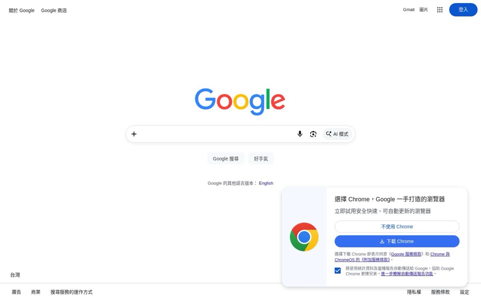
What we saw: Google search homepage (Taiwan, Traditional Chinese) with a Chrome download pop…

Three things we noticed

  1. The '好手氣' (I'm Feeling Lucky) button offers to skip the choosing, on a page built for choosing.

    I'm Feeling Lucky button
  2. The emptiest page on the internet found room for a pop-up, and it's for Google's own browser.

    Chrome pop-up
  3. The stats-sharing box comes pre-ticked, so saying yes to Chrome also says yes on your behalf.

    pre-ticked checkbox

The one fix

Show the Chrome pop-up only after someone has done a search, not on arrival, and leave the 'send usage statistics' box unticked so visitors choose it themselves.

The full roast

The 5-second test

I think it's Google, the search engine. It's for anyone who wants to look something up, and I'd click the empty box in the middle and start typing. Then a Chrome advert slides in at the bottom right and asks me to switch browsers before I've searched anything.
What I think you sell
Web search, with voice, image and an 'AI 模式' (AI Mode) option
Who I think it's for
Anyone with a question, which is everyone

Headline and value

7/10

The logo is the headline, and for this brand that mostly works.

There's no sentence saying what the page does, just the 'Google' logo and an empty box. For people who already know Google, that's enough. A first-timer gets no hint, though: the box has no prompt text, and the newest feature, 'AI 模式' (AI Mode), comes with no clue about what it does or why you'd pick it over a normal search. The page shouts its name and whispers its newest idea.

Quick win: Put light gray prompt text inside the empty box, such as 'Search or ask anything', so the box explains itself and quietly hints at AI Mode.

Call to action

7/10

The real action is the box, but the brightest blue buttons are 'Sign in' and 'Download Chrome'.

The main job is typing in the box, and the box is big, centered and impossible to miss. The two search buttons under it, 'Google 搜尋' (Google Search) and '好手氣' (I'm Feeling Lucky), are pale gray on white and nearly vanish. Meanwhile the strongest color on the page goes to '登入' (Sign in) in the top corner and the solid blue '下載 Chrome' (Download Chrome) in the pop-up. So your two loudest buttons both send people away from searching.

Quick win: Make '登入' (Sign in) an outlined button instead of solid blue, so the only filled color near the search box is the box itself.

Look and layout

8/10

Beautifully calm, until the pop-up parks in the bottom right.

The eye lands on the colorful logo, then drops straight into the search box. There's plenty of empty space and very little else to look at, which is exactly right. Then the Chrome pop-up covers part of the bottom bar, crowds the 'Google 的其他語言版本: English' (Google in other languages: English) line, and brings a big Chrome logo that competes with the main logo. Two colorful circles-and-letters logos on one screen is one too many.

Quick win: Hold the Chrome pop-up until after someone's first search, so the first screen is just the logo and the box.

Trust and proof

7/10

The name does the trusting, and the pre-ticked box chips away at it.

Nobody needs reviews to trust Google, and the footer links to '隱私權' (Privacy), '服務條款' (Terms) and '搜尋服務的運作方式' (How Search works) are where people expect them. The weak spot is the pop-up: the box for '將使用統計資料及當機報告自動傳送給 Google' (Automatically send usage statistics and crash reports to Google) is already ticked, in small gray text, under two lines of terms links. When a company this big pre-ticks the 'send us your data' box, people notice.

Quick win: Leave the usage statistics box unticked by default and let visitors choose it.

Copy

8/10

Almost no words, and most of them earn their place.

The page does its job with button labels and icons, which is the right call. The pop-up's '選擇 Chrome,Google 一手打造的瀏覽器' (Choose Chrome, the browser built by Google) and '立即試用安全快速、可自動更新的瀏覽器' (Try a safe, fast browser that updates itself) are clear, if generic. '好手氣' (I'm Feeling Lucky) means nothing to a newcomer, and 'AI 模式' (AI Mode) has no explanation anywhere on the screen.

Quick win: Add a tiny tooltip or hover text to 'AI 模式' (AI Mode), like 'Ask a full question and get a written answer', so first-timers know why to press it.

Mobile

7/10

Big box, easy taps, and a 'Trending searches' list that fades out like a ghost story.

The search box is wide and easy to tap, and its three icons are a comfortable thumb size. The top is a little odd: 'ALL' sits in the menu row while 'IMAGES' drops onto its own line below, which looks like a broken menu. Further down, 'Trending searches' fades each line lighter until 'fridge cyber attack' is barely readable, which is a thrilling headline to make nearly invisible. The bright blue 'Sign in' is again the loudest thing on the screen.

Quick win: Put 'ALL' and 'IMAGES' side by side on one row, and show three trending searches at full contrast instead of six fading ones.
Top fixes, in order

  1. Move the Chrome pop-up and untick its box

    Why: The pop-up appears before anyone has searched, covers the bottom of the page, and has the 'send usage statistics and crash reports' box already ticked. It interrupts the one job people came to do and makes a privacy choice for them.

    How: Show the pop-up only after someone's first search, and leave the '將使用統計資料及當機報告自動傳送給 Google' (Automatically send usage statistics and crash reports to Google) box unticked by default.

  2. Put prompt text in the empty box

    Why: The box is completely empty, with a '+' on the left and three icons on the right. Newcomers get no hint that they can type, talk, use a picture, or ask AI Mode.

    How: Add light gray text inside the box, such as 'Search or ask anything', or in Chinese '搜尋或提出任何問題' (Search or ask any question).

  3. Let the search box win the color fight

    Why: The solid blue '登入' (Sign in) and '下載 Chrome' (Download Chrome) buttons are the brightest things on the screen. The search buttons, 'Google 搜尋' (Google Search) and '好手氣' (I'm Feeling Lucky), are pale gray and easy to miss.

    How: Make '登入' (Sign in) an outlined button and keep the pop-up off the first screen. Then the logo and the box are the only things that pull the eye.

  4. Fix the broken-looking phone menu

    Why: On the phone, 'ALL' sits in the top row while 'IMAGES' drops to its own line underneath, which looks like a layout bug rather than two tabs.

    How: Put 'ALL' and 'IMAGES' side by side on one row under the top bar, with the blue underline marking whichever one is active.

  5. Stop the trending list fading away

    Why: On the phone, 'Trending searches' gets lighter line by line until 'nagoshi studio games' and 'fridge cyber attack' are hard to read. It looks like a loading glitch, and it takes up most of the screen below the box.

    How: Show three trending searches at full contrast and add a 'More trending searches' link, instead of six lines that fade to white.

Rewrites to steal

Headlines

Search anything. Or just ask.

plain and literal

Type it, say it, or show it.

options first

One box for every question.

simplicity first

Subheadlines

Search by typing, by voice, or with your camera, all from the box below.

how it works

Want a written answer instead of a list of links? Try AI Mode.

new feature first

Google Search, now with AI Mode for longer questions.

plain and literal

Button text

Search

plain and literal

Ask AI Mode

new feature first

Search with a photo

options first