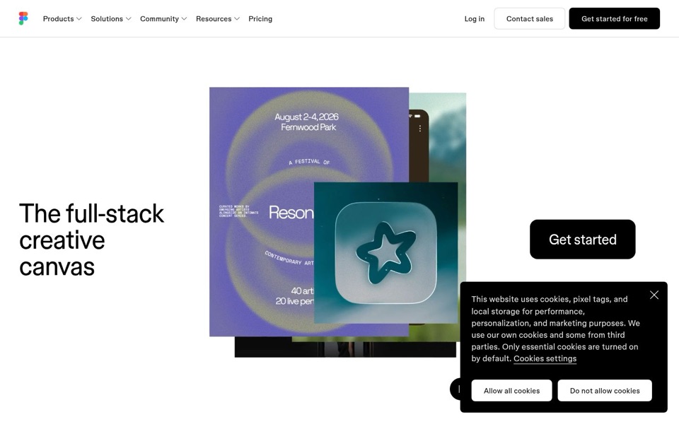
Headline and value
4/10Five words, and none of them says what you actually do here.
"The full-stack creative canvas" sounds confident but describes a feeling, not an activity. "Full-stack" is a builder's word most visitors won't know, and "canvas" could mean a painting app, a whiteboard or a website builder. There is no line underneath to explain, so the collage has to do all the talking. It reads like the festival poster's own tagline: lovely lettering, no line-up.
Quick win: Add one plain sentence under the headline, such as: "Design posters, app icons and phone screens side by side, all on one canvas."
Call to action
6/10Strong black buttons, but they're scattered and wear two different names.
"Get started for free" in the top corner is clear and high-contrast, and the word "free" is doing real work. The big "Get started" button is stranded on the far right, separated from the headline by the whole collage, and it drops the word "free". Up top it also shares space with "Log in" and "Contact sales", and the cookie box sits right on top of another black button peeking out at the bottom.
Quick win: Put the main button directly under the headline on the left and use the same words everywhere: "Get started for free".
Look and layout
7/10The collage is gorgeous. The layout makes your eye do a long walk.
The purple festival poster and glassy star icon grab attention first and quietly show the kind of work people make here. The headline sits far left, the collage in the middle and the button far right, so the eye travels across the whole screen without a clear path. There is lots of calm, empty space, but the cookie box is the heaviest black shape on the page and wins the staring contest.
Quick win: Group the headline, the new explanation line and the button together in the left column so the collage becomes the backdrop, not the divider.
Trust and proof
3/10Nothing on the first screen tells me anyone else uses this.
Before scrolling there are no customer logos, no quotes, no user numbers and no mention of who relies on it. The only hints of a big operation are the "Contact sales" button and the long menu. There may be proof further down, but I can't see it, and a stranger deciding in five seconds can't either.
Quick win: Add a single line of proof under the main button, such as "Trusted by [number] teams", or a short row of customer logos if you have permission to show them.
Copy
4/10The cookie box has more words than the rest of the page combined.
Apart from the menu, the page's own message is five words: "The full-stack creative canvas." The cookie notice gets about fifty. The tone is sleek and modern, but "full-stack" is shorthand that leaves non-technical visitors guessing, and nothing names a task, a result or a person. The collage hints at posters, apps and phone screens, but the words never say so.
Quick win: Swap "full-stack" for words a visitor can picture, such as "One canvas for posters, apps and everything in between."
Mobile
5/10Readable headline, then the cookie box eats the bottom half of the screen.
The headline is large and easy to read, and "Get started for free" is a big, clear button at the top. The top corner is a stretch for a thumb, though, and there is no second button lower down. The collage takes the middle, and the cookie box with its two full-width buttons covers roughly the bottom 40 percent, so a phone visitor sees the headline, half a poster and a privacy notice.
Quick win: Turn the cookie notice into a slim bar along the bottom with the two choices side by side, and add a "Get started for free" button right under the headline.