All roasts
duolingo.com as our browser saw it on 3 Nov 2026
duolingo.com, roasted on 3 Nov 2026.

Golden

One owl, two buttons, and a flag strip that thinks chess is a country.

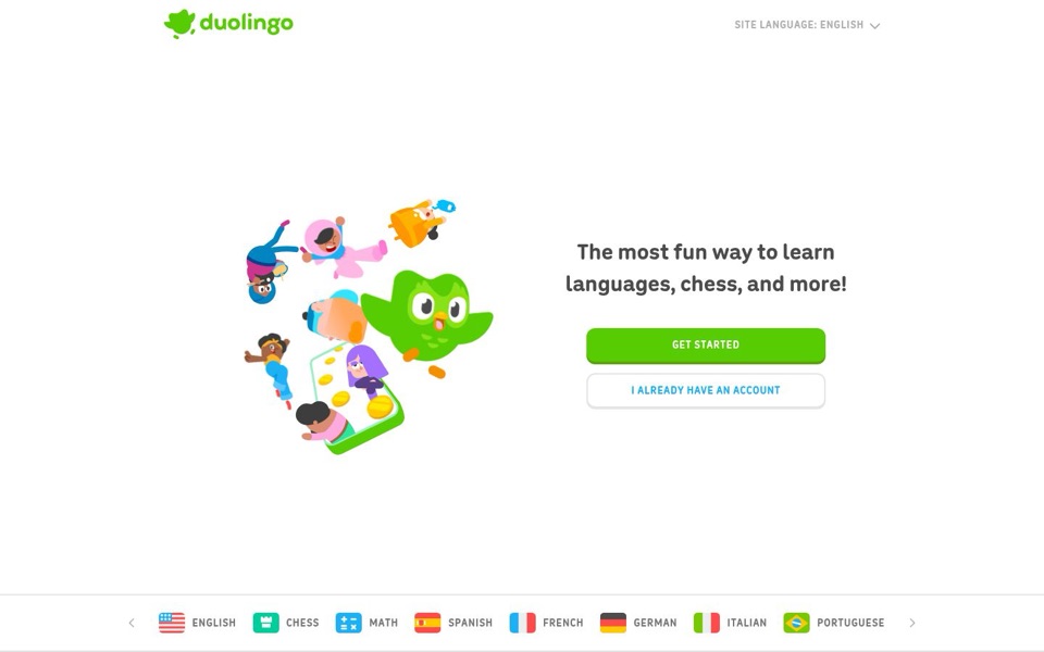
What we saw: a language-learning app that now also teaches chess and math

Three things we noticed

  1. 'Languages, chess, and more!' reads like a menu that gave up listing and just wrote 'etc.'

    top headline
  2. A crowd and an owl spill from a phone with gold coins, like a slot machine paying out pupils.

    tumbling character illustration
  3. Nothing on screen says what it costs, so 'GET STARTED' leaves visitors to guess what they're starting.

    GET STARTED button

The one fix

Add one short line under the headline that answers the price and effort questions, for example 'Free, bite-sized lessons you can do in a few minutes a day' (if that's accurate). Swap 'and more!' for the real list if it's short, so visitors know exactly what's on offer.

The full roast

The 5-second test

I think it's the green owl app for learning languages, and apparently chess too, plus some mystery 'more'. I can't tell from this screen whether it costs anything or how much time it takes. I'd click 'Get started' anyway, because it's the only big green thing on the page.
What I think you sell
A playful learning app for languages, chess and math
Who I think it's for
Anyone who wants to learn a language (or chess, or math) without it feeling like school

Headline and value

6/10

Big promise, fuzzy ending: 'and more!' does the work a real list should do.

'The most fun way to learn' is a clear, confident promise, and 'languages, chess' tells me what's on the menu. Then 'and more!' shrugs, even though the strip at the bottom already shows the 'more': it's math. There's no line under the headline, so it never says why this beats a textbook, a class or another app, and it never answers the two questions every visitor brings: what does it cost, and how much time does it take?

Quick win: Replace 'and more!' with what the bottom strip already shows: 'The most fun way to learn languages, chess, and math.' Then add one line underneath about cost and time (see fix #1).

Call to action

9/10

One loud green button, one quiet one. Hard to get wrong.

'Get started' is bright green, full width and the first thing your eye lands on after the owl, so the next step is obvious. 'I already have an account' sits underneath in a plain white box with blue text, clearly second in line, which is exactly where it belongs. The only gap is that 'Get started' doesn't say what starts: a quiz, a lesson, a sign-up form?

Quick win: Make the label say what happens next, for example 'Start your first lesson', and keep the second button exactly as it is.

Look and layout

8/10

Clean, friendly and very green, though the characters are mid-tumble down a phone screen.

There's lots of breathing room, one headline, two buttons, and the owl is instantly recognisable. The illustration has energy, but it shows people falling sideways past coins, which says 'fun' without showing what a lesson actually looks like. The flag strip at the bottom is tidy, but it puts the Chess and Math icons in a row of country flags, so it reads like chess got its own passport.

Quick win: Add a small label above the bottom strip, such as 'Pick what to learn:', so it reads as a menu of choices rather than a row of decorations.

Trust and proof

4/10

The first screen leans entirely on the owl's reputation.

Nothing visible here backs up 'the most fun way': no rating, no learner count, no review, no word on price. Plenty of visitors already know the owl, but a first-timer gets nothing that answers 'is this good, and is there a catch?' If any proof lives further down the page, I can't see it in these screenshots.

Quick win: Put one short line of proof directly under the two buttons, for example 'Join [number] learners worldwide.' using your real figure.

Copy

7/10

Short and warm, but the most useful sentence hasn't been written yet.

The whole page is roughly fifteen words, and it never uses jargon, which is a real strength. But 'most fun' is a claim anyone can make, and 'and more!' with an exclamation mark sounds a bit like a party invitation that forgot the address. The words never mention lessons, time or price, so the visitor has to click just to find out the basics.

Quick win: Add one plain sentence under the headline that covers price and effort, for example 'Free, bite-sized lessons you can do in a few minutes a day' (only if that's accurate for you).

Mobile

8/10

Great buttons for a thumb, but the headline ends with 'and more!' alone on its own line.

Both buttons stretch the full width of the phone and are easy to tap, and the green one is clearly the main one. The headline is big and readable, but it breaks so that 'and more!' sits alone on the last line, which spotlights the vaguest words on the page. The language and subject strip from desktop doesn't appear here, so a phone visitor sees no hint of what they can learn beyond 'languages, chess'. There are also large empty gaps above the headline and above the buttons.

Quick win: Use the shortened headline from fix #2 so it ends on 'math' rather than 'more!', and put the new cost-and-time line in the gap above the buttons.
Top fixes, in order

  1. Answer cost and time under the headline

    Why: Nothing on the first screen says what it costs or how long a lesson takes, so a careful visitor has to click 'Get started' just to find out whether there's a catch.

    How: Add one line under the headline, for example: 'Free, bite-sized lessons you can do in a few minutes a day.' Only use it if it's accurate; otherwise state your real price and lesson length.

  2. Swap 'and more!' for the real list

    Why: The bottom strip already shows the 'more' is math, so the headline is hiding a fact the page already knows. On a phone, 'and more!' even gets a line to itself.

    How: Change the headline to 'The most fun way to learn languages, chess, and math.'

  3. Add one line of proof by the buttons

    Why: There's no rating, review or learner count anywhere on the first screen, so 'most fun' rests on your word alone for anyone who doesn't already know the owl.

    How: Under 'I already have an account', add a small grey line such as 'Join [number] learners worldwide.' using your real figure.

  4. Label the bottom strip as a menu

    Why: Chess and Math sit in a row of country flags with no heading, so it looks like a decoration rather than a list of things you can learn, and on a phone it doesn't show at all.

    How: Add 'Pick what to learn:' above the strip on desktop. On phones, show a short row such as 'Spanish · French · German · Chess · Math' just above the buttons.

  5. Make the main button say what starts

    Why: 'Get started' is easy to see but doesn't say whether you're starting a lesson, a quiz or a sign-up form.

    How: Change it to 'Start your first lesson' and leave 'I already have an account' as it is.

Rewrites to steal

Headlines

The most fun way to learn languages, chess, and math

keep it, finish it

Learn Spanish, French, chess or math, one game-like lesson at a time

plain and literal

Learning that feels like playing a game

feeling first

Subheadlines

Free, bite-sized lessons you can do in a few minutes a day.

cost and effort

Pick Spanish, French, German, Italian, Portuguese, English, chess or math, and start your first lesson now.

show the menu

Lessons in [number] languages, plus chess and math, all in one app.

range first

Button text

Start your first lesson

say what happens

Pick what to learn

choice first

Start learning now

plain and urgent