Headline and value
5/10The headline is a pun about 'work' that never says what Dropbox does.
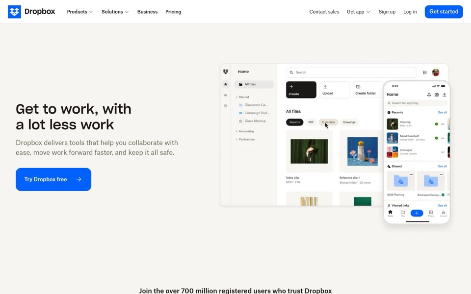
'Get to work, with a lot less work' uses the word 'work' twice in eight words, which is a lot of work for a sentence promising less of it. It names no outcome you can picture: no files, no sharing, no phone. The subheadline, 'delivers tools that help you collaborate with ease, move work forward faster, and keep it all safe', could sit on almost any office software page. The product picture does the explaining the words skip: folders, an 'Upload' button, a search bar and a phone version.
Quick win: Keep the playful line if you love it, but change the subheadline to: 'Store, share and find your files from your laptop or your phone.'
Call to action
7/10The main button is clear and strong, but the menu offers two more ways to start.
'Try Dropbox free' is big, bright blue, has an arrow and puts 'free' right in the label, so it's an easy click. The trouble is the top menu also has 'Sign up' and a blue 'Get started', so a visitor sees three different ways to begin and might wonder whether they're different. Nothing sits next to the main button to say what you get for free or that no card is needed.
Quick win: Rename the menu's 'Get started' to 'Try Dropbox free' so it matches, and add one small line under the main button, such as 'Free to start. Upgrade anytime.'
Look and layout
8/10Calm, tidy and easy to read, with a lot of empty floor space.
The eye goes straight to the big black headline, then the blue button, then the product picture, which is the right order. The picture is genuinely useful: 'All files', 'Upload', 'Create folder' and a phone showing the same files explain the product better than the text. The main weakness is the large empty band above the headline and below the button, which pushes the '700 million' line half off the first screen.
Quick win: Shrink the empty space above the headline and below the button so the '700 million registered users' line fits fully on the first screen.
Trust and proof
6/10The strongest number on the page is filed in the very bottom folder.
'Join the over 700 million registered users who trust Dropbox' is a huge reason to sign up, and it sits at the bottom edge, half cut off, where many visitors won't read it before deciding. There are no customer logos, reviews or security mentions visible on the first screen, though they may live further down; I can't see past the cut. 'Keep it all safe' in the subheadline is the only safety promise, and it's a passing phrase rather than a reason to believe it.
Quick win: Move the line directly under 'Try Dropbox free' as: 'Join over 700 million registered users who trust Dropbox.'
Copy
5/10Short and friendly, but almost every phrase is general rather than specific.
'Collaborate with ease', 'move work forward faster' and 'keep it all safe' are three broad promises with no detail behind any of them. The page never uses the plain words a visitor would search for, like files, folders, share or phone, even though the picture shows all of them. 'Join the over 700 million' also has a stray 'the' that trips the reader.
Quick win: Swap each general phrase for what the picture shows: 'Upload anything, share a folder with your team, and open it on any device.'
Mobile
6/10The phone version is readable, then a Google sign-in pop-up grabs the bottom of the screen.
The headline and 'Try Dropbox free' are large, and the button is wide and easy to hit with a thumb. But a pop-up reading 'Google で Dropbox にログイン' (Log in to Dropbox with Google) with its own big blue '次へ' (Next) button covers the bottom, so a first-time visitor now has two big blue buttons asking for different things. The '700 million' line doesn't show on the phone's first screen at all, and the logo shrinks to just the blue box icon with no 'Dropbox' name.
Quick win: Hold the Google sign-in pop-up until the visitor scrolls or taps 'Log in', so the first screen has only one big blue button.