Headline and value
7/10Clear category, fun pun, but no reason to switch from the group chat you already have.
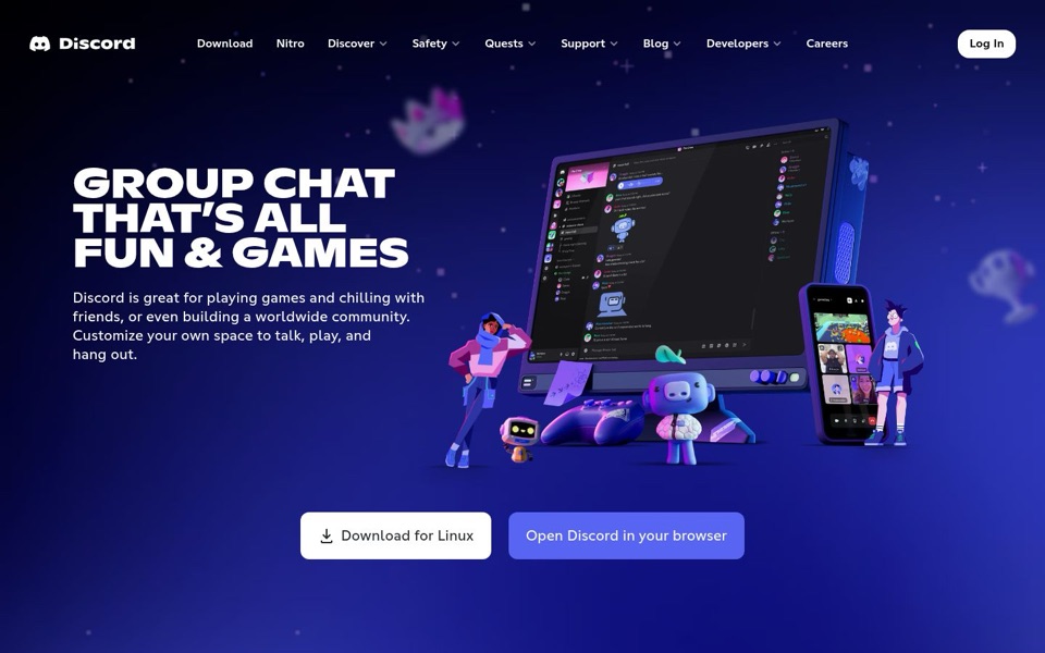
'GROUP CHAT THAT'S ALL FUN & GAMES' names the category in two words, and the pun fits the controller and characters around it. What it doesn't say is what you get here that a regular group chat lacks. The paragraph below hedges with 'or even building a worldwide community', which reads like a second product squeezed into an afterthought. The illustration shows video call tiles on the phone, but the words never mention talking out loud or seeing each other, so the biggest difference goes unsaid.
Quick win: Change the paragraph's first line to name what's visible in the picture: 'Text, talk and play together in your own space, with your friends or a worldwide community.'
Call to action
7/10Two well-worded buttons, parked a long walk from the words that sell them.
'Download for Linux' and 'Open Discord in your browser' are plain, specific labels, and the white button clearly leads. But the headline and paragraph sit on the left, while the buttons sit centered at the bottom, past the monitor, controller and mascot. The eye reads the promise, then has to cross the whole illustration to act on it. Up top, the white 'Log In' is the only button in the menu, so for a second it looks like the main action.
Quick win: Put both buttons directly under the paragraph, left-aligned with the text, white download button first.
Look and layout
8/10Polished, on-brand and lively; the illustration just takes up more room than it earns.
The heavy capitals headline is the first thing you see, the purple-on-navy palette is consistent, and the characters make the product feel friendly rather than technical. The app window on the monitor is a nice touch, but at this size the chat is unreadable, so it works as mood rather than a product preview. The blurry floating crown and trophy add charm and a bit of noise. The menu crams nine links plus four dropdown arrows into one row.
Quick win: Shrink the illustration slightly so the buttons fit under the text, and drop the menu to the five links new visitors actually use.
Trust and proof
5/10Everyone knows the logo, but the page proves nothing to someone who doesn't.
The first screen has no count of people using it, no quotes, no well-known communities, and no word on whether it costs anything. 'Safety' sits in the menu, which is good, but there's nothing reassuring near the buttons. 'Nitro' in the menu hints at a paid tier, so a newcomer might wonder whether the download is free. The page may show proof further down; I can't see it.
Quick win: Add one short line under the buttons with a real number, such as 'Join [your number] people already hanging out on Discord'.
Copy
7/10Friendly and plain, with a couple of wasted words.
The tone matches the drawings, and everyday words like 'chilling with friends' and 'hang out' land well. 'Discord is great for' is filler: the page shouldn't have to grade itself. 'Customize your own space' is vague; 'space' could mean anything, and 'customize' tells you nothing you'd do on a first visit. The pun in the headline carries the personality, so the paragraph can afford to be more literal.
Quick win: Cut 'Discord is great for' and open with the verbs: 'Play games, chill with friends, or build a worldwide community, all in a space you set up yourself.'
Mobile
6/10Big buttons, but a phone being offered a Linux download.
Both buttons are wide, tall and easy to hit with a thumb, and the text is readable. But the illustration stacks first, pushing the headline about halfway down the screen and the buttons further still, so the first thing a phone shows is a picture of a computer. The main button still says 'Download for Linux', which is no help on a phone, and the phone has to scroll past art to find even that.
Quick win: On phones, show the headline first and swap the white button to a phone-friendly label like 'Get the app' that goes to the right app store.