Headline and value
6/10The headline asks the question. The small line underneath has to answer it.
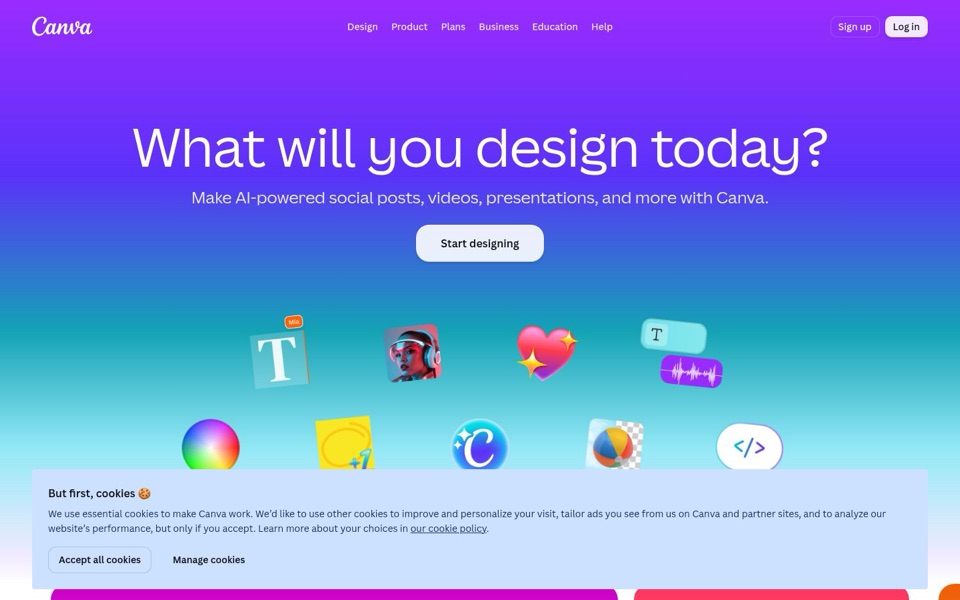
'What will you design today?' is friendly, but it hands the visitor a blank canvas and asks them to fill it, which is the exact feeling a design tool should remove. The real offer sits in the smaller line: 'Make AI-powered social posts, videos, presentations, and more with Canva.' Even that line lists things to make without saying what you get, like speed, ease, or not needing design skills. Nothing here says why Canva and not the other tool already open in your browser.
Quick win: Move the real offer into the big headline and turn the question into the smaller line, for example: 'Make social posts, videos and presentations in one place', with 'What will you design today?' underneath.
Call to action
6/10'Start designing' is a good label, but the 'Log in' button at the top shines brighter.
'Start designing' is short and active, and it sits right under the headline where the eye expects it. But its pale lavender fill is soft against the purple, and the floating icons below it, like the rainbow color wheel and the glowing heart, are louder. At the top right, 'Log in' gets the solid white button while 'Sign up' is only an outline, so new visitors are steered toward the button that isn't for them. On desktop the cookie banner also has its own 'Accept all cookies' button sitting in the middle of the screen, competing for the same click.
Quick win: Make 'Sign up' the filled white button and 'Log in' the plain outline, then give 'Start designing' a stronger fill, like solid white with dark text, so it's the brightest thing on the first screen.
Look and layout
7/10A cheerful gradient and a sticker sheet of icons that never say what they are.
The purple-to-teal gradient is clean, the headline is huge and easy to read, and the space around it lets it breathe. Below it, nine floating icons appear: a 'T' tagged 'Mia', a woman in headphones, a sparkly heart, a sound wave, a color wheel, a yellow note with '+1', the Canva 'C', a beach ball on a see-through checkerboard, and a '</>' bubble. They hint at features, but a visitor has to play charades to guess them. Is the beach ball about removing backgrounds? Is '</>' about code? It looks like a sticker book where every sticker forgot its caption. On desktop the cookie banner then covers the bottom row and whatever comes after it.
Quick win: Give each floating icon a two-to-three-word label that names the feature it stands for, using the feature names Canva already uses elsewhere.
Trust and proof
3/10No reviews, no user count, no logos. Just vibes and a cookie.
The first screen shows no customer numbers, ratings, well-known company logos or quotes. There's also no mention of price or whether you can start for free, even though the menu has a 'Plans' link. A big brand can rely on people already knowing the name, but a first-time visitor sees nothing that says other people trust this. Proof may exist further down the page, but it isn't visible here, and the cookie banner covers the spot where it might start.
Quick win: Add one short line of proof right under 'Start designing', for example: 'Used by [your number] people to make posts, videos and slides.'
Copy
7/10Short and friendly, with one vague buzzword doing heavy lifting.
There's very little text, and that's a strength: one headline, one line underneath, one button. But 'AI-powered' tells the visitor nothing about what the AI actually does for them, and 'and more' is a shrug at the end of the list. The phone version, 'Make socials, videos, slides, and more with Canva', is actually tighter than the desktop one, and the desktop could borrow it. The longest piece of writing on the first screen is the cookie notice, which is a strange thing to win.
Quick win: Replace 'AI-powered' with what the AI does for the person, using the feature Canva most wants to promote, for example: 'Make social posts, videos and slides, with AI that helps you get started.'
Mobile
4/10On a phone, the cookies get the big button and the product gets nothing.
The phone header shows only the menu icon, the logo and 'Log in'. There's no 'Sign up' anywhere, so a new visitor's only visible choice is the button for people who already have an account. The headline wraps onto three huge lines ('What will / you design / today?'), which pushes 'Start designing' down until the cookie banner covers it completely. The banner fills the bottom 40% of the screen, and 'Accept all cookies' is the widest, easiest button to tap with a thumb. The page offers the snack before the meal.
Quick win: Put a filled 'Sign up' button in the phone header next to 'Log in', and shrink the headline so 'Start designing' sits above where the cookie banner starts.