Headline and value
6/10The name does all the work, and the promise is missing.
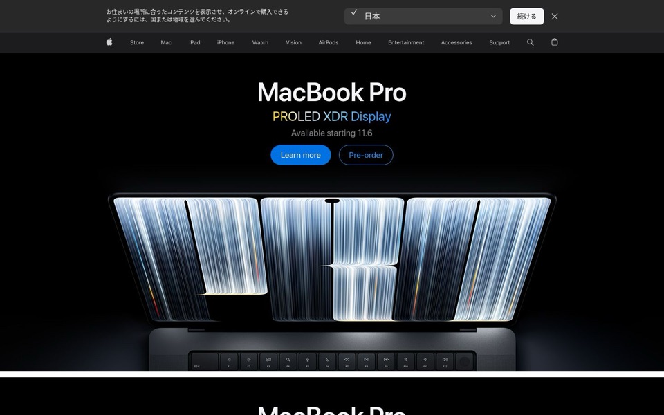
The big headline is just 'MacBook Pro', and the line under it, 'PROLED XDR Display', is a product name, not a reason to care. Nothing on the first screen says what the new display does for the person looking at it: sharper photos, easier on the eyes, or something else. Apple's name carries a lot, but a first-time visitor learns that something is new without learning why it matters. The colour split also works against the words: 'PRO' is yellow and 'LED' is white, so the eye reads 'PRO' plus 'LED' and the 'OLED' disappears.
Quick win: Add one plain line between the display name and the date that says what the new screen does for the viewer, in Apple's own words from further down the page.
Call to action
7/10Two clear buttons, but the one that sells is the quiet one.
'Learn more' is the solid blue button and 'Pre-order' is the outlined one, so the eye goes to reading before buying. On a launch page with 'Available starting 11.6' right above, pre-ordering is the action that counts, yet it looks like the backup option. Both labels are short and clear, and nothing crowds them, which is good. Visitors just get a choice when one main button would do.
Quick win: Make 'Pre-order' the solid blue button and turn 'Learn more' into the outlined one, or into a simple text link under it.
Look and layout
9/10Beautiful, calm, and the laptop literally spells 'PRO' at you.
The black background, centred headline and one large product photo give the eye a clear path: the name, the display name, the buttons, then the laptop. There is plenty of breathing room and nothing fights for attention. The photo of the screen showing giant 'PRO' letters is a nice touch, though it says 'PRO' a third time in one screen after 'MacBook Pro' and 'PROLED'. The only messy part is the dark region bar at the very top, which pulls the eye before the product does.
Quick win: Keep everything, but make the region bar slimmer and lower in contrast so the first thing anyone reads is 'MacBook Pro', not a country picker.
Trust and proof
8/10The apple logo is the proof, but the price is hiding.
For this brand, the logo in the top menu and the familiar store layout do most of the trust work, and the shopping bag icon signals you can buy right here. What's missing from the first screen is the price: 'Pre-order' asks for money without saying how much, so careful buyers have to click away to find out. There are no reviews or quotes visible, which is normal before launch, but I can't see whether anything further down covers it.
Quick win: Add the starting price next to the date, like 'From [price]. Available November 6.', so pre-order doesn't feel like a blind click.
Copy
6/10Short and sleek, but '11.6' needs a translator.
'Available starting 11.6' is the weakest line on the page: some people will read November 6, others June 11, and on a laptop page plenty will think it's an 11.6-inch screen. 'Available starting' is also slightly odd for a single date; 'Available' alone does the job. The words are mercifully short, but 'PROLED XDR Display' is three made-up terms in a row with no plain explanation. Below the first screen, the next section repeats 'MacBook Pro' and 'Available starting 11.6' word for word, so the two sections blur together.
Quick win: Change 'Available starting 11.6' to 'Available November 6' (or the correct month) in both sections.
Mobile
8/10Works well on a phone, once you get past the region bar.
The buttons 'Learn more' and 'Pre-order' are large, well spaced and easy to hit with a thumb, and the headline text is big and readable. The region bar ('Choose another country or region...') takes up roughly the top sixth of the screen with its own large 'Continue' button, which looks more clickable than either product button. The laptop photo stacks nicely under the buttons, and the next 'MacBook Pro' section starts right after, again with the same '11.6' date, so a scrolling visitor sees two near-identical headlines in a row.
Quick win: On phones, shrink the region bar to a single line with a small link (for example 'Shopping from Hong Kong? Switch region') so the product takes the top of the screen.