Headline and value
5/10A strong first line keeps going until it becomes a company statement.
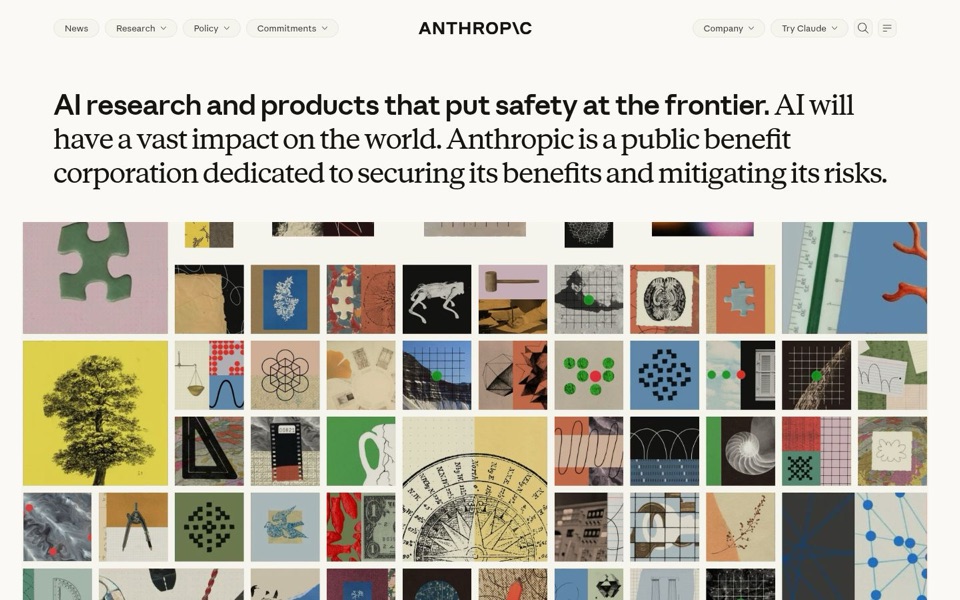
The bold opener, "AI research and products that put safety at the frontier," is a real headline: short, clear and different from rivals who lead with speed or power. But the text never stops. It switches to a lighter font and carries on for three more sentences at almost the same giant size, ending on "mitigating its risks." It reads like a headline that missed its stop and stayed on the bus. Nowhere does it say what a visitor gets, or that Claude is the product you can use.
Quick win: Keep only "AI research and products that put safety at the frontier." at full size, and drop the rest to a smaller line underneath that names Claude.
Call to action
3/10The one thing to do is a small pill in the corner, dressed like a menu item.
"Try Claude" sits top right, the same size, shape and grey as "Company" and "Policy," with the same little dropdown arrow. Nothing on the first screen points to it, and there is no button under the headline at all. Visitors who finish reading have to go back up to the menu to find out what to do next. The arrow also makes them wonder if they'll get a list of choices instead of the product itself.
Quick win: Add a solid, dark button reading "Try Claude" directly under the headline text, with no dropdown arrow, at least twice the size of the menu pills.
Look and layout
7/10Beautiful and calm, but the collage takes the stage from the product.
The cream background, crisp black type and paper-cut collage feel thoughtful and unlike any other AI company, which is a real asset. The trouble is size: the collage fills everything below the text with about sixty tiles, from a gavel to a dollar bill to a nautilus shell, and none of them shows Claude. There is literally a green jigsaw piece in the top left, and it's the piece visitors are missing: what the product looks like. The eye goes headline, then wanders the tiles, then has nowhere to land.
Quick win: Replace one row of tiles with a single framed screenshot of Claude answering a question, styled in the same cream and black so it fits the look.
Trust and proof
5/10The only proof on screen is "public benefit corporation," buried mid-paragraph.
"Anthropic is a public benefit corporation" is a meaningful signal of trust, but it sits in the middle of the long sentence where few people will notice it. There are no customer names, quotes, numbers, or links to research results visible before anyone scrolls. Those may exist further down the page; I can't see them. For a page whose whole message is safety, the first screen asks to be trusted without showing why.
Quick win: Pull "A public benefit corporation" out as its own small line just above the headline, and add a link right beside the main button reading "Read our research."
Copy
6/10Sincere and well-written, but formal enough to read like a report.
The tone is calm and confident, with no shouting or hype, which suits the subject. But phrases like "securing its benefits and mitigating its risks" and "vast impact on the world" are big and abstract, and they talk about AI in general rather than about what a visitor can do here. "AI will have a vast impact on the world" is true and also something any AI company could print. The word "Claude" appears only in the menu, never in the actual writing.
Quick win: Cut "AI will have a vast impact on the world." entirely, and use that space to say Claude is the AI Anthropic builds and that you can try it.
Mobile
5/10On a phone, the paragraph fills the screen and then a shell takes over.
The text is large and easy to read, and "Try Claude" is a comfortable size for a thumb, which is good. But the long paragraph takes up the whole first screen, followed by a big blank beige band and then a nautilus shell filling the rest. A visitor scrolls past all of it and still meets no button, no picture of Claude, and no next step. The shell is lovely, but it spirals inward, and so does the visitor's sense of where to go.
Quick win: On phones, show only the bold first line, a one-line explanation of Claude, and a full-width "Try Claude" button before the image, and remove the empty band above the shell.