Headline and value
5/10There's no headline. The biggest sentence on the page is about fees.
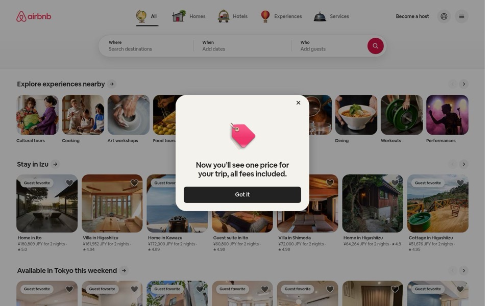
The first screen has no line saying what this is or why to use it. The search bar's 'Where / When / Who' does the explaining, which works for people who already know the name and leaves strangers to guess. The only full sentence in big type is the pop-up's 'Now you'll see one price for your trip, all fees included.' That's a real reason to book here, but it's said once in a box people close, not kept on the page. The page greets you like a hotel desk clerk who skips 'welcome' and opens with the bill.
Quick win: Add one short line under the search bar on both desktop and phone: "Homes, hotels and experiences. One price, all fees included."
Call to action
7/10The pink search button is clear, then the pop-up's 'Got it' takes the spotlight.
The round pink search button sits at the end of 'Where / When / Who', so it's obvious what it does. On desktop, though, the pop-up dims everything and its big black 'Got it' bar becomes the boldest button on the screen. Visitors' first click is spent closing a box. 'Become a host' sits up top in quiet text, which is right: it doesn't fight the search.
Quick win: Remove the desktop pop-up so the pink search button is the first thing anyone clicks. Put the fee message right next to the prices instead.
Look and layout
7/10Lovely photos and tidy cards, under a grey blanket.
The listing photos (the Izu villas, the sea view from Kawazu) and the experience tiles (pottery hands, ramen bowl) do the selling. The rounded cards are spaced evenly, and the little 3D icons on 'All', 'Homes', 'Hotels', 'Experiences' and 'Services' are friendly and easy to scan. The pop-up greys out the whole page, so the best part of the design, the photos, shows up dimmed on first load. The cut-off cards on the right edge of each row hint that you can scroll sideways, which is a nice touch.
Quick win: Show the first screen without the grey layer. If the fee message must float, use a small note at the bottom like the phone version, not a box in the middle.
Trust and proof
8/10Ratings on every card and honest totals. Strong.
Every listing shows a star rating (4.86 to 5.0) and a full price 'for 2 nights', so visitors get proof and price at a glance. 'Guest favorite' badges add more reassurance, but in the 'Available in Tokyo this weekend' row nearly every card has one, so the badge starts to mean less. The 'all fees included' promise is one of the strongest trust signals here, and right now it lives only in a pop-up and a floating note that both disappear.
Quick win: Put a small permanent line under the first row of prices: "Total price, all fees included." That way the promise stays visible after the pop-up is gone.
Copy
7/10Short and plain. 'Where / When / Who' is copy most pages would envy.
The search labels and 'Search destinations', 'Add dates', 'Add guests' could not be clearer. The prices are a bit cluttered: '¥180,809 JPY' says yen twice, and 'for 2 nights' doesn't say which two nights when no dates have been entered. The phone's row lines like 'Vietnam's biggest city for street food' give a reason to look, but desktop rows like 'Stay in Izu' have no such line. 'Explore experiences nearby' is the one heading that could sit on any travel site.
Quick win: Show the price as "¥180,809 for 2 nights" (drop the repeated JPY). In the 'this weekend' rows, say "for 2 nights this weekend" so the dates are clear.
Mobile
7/10The phone gets the fee note right, then a blue button tries to steal the show.
'Start your search' is a big, thumb-friendly bar, the tabs are large, and the bottom menu ('Explore', 'Wishlists', 'Log in') is easy to reach. At the very top, though, the 'USE APP' button is the only bright blue thing on a pink-and-white page, so it's the first thing the eye hits, ahead of the search. The 'Prices include all fees' note is a better idea than the desktop pop-up, but it floats over the listing names ('Apartment in...') in the second row. The first phone screen still shows the search bar, one full row with prices and ratings, and the start of the next row, which is good.
Quick win: Make the 'USE APP' button match the brand pink or turn it into a plain text link. Move the fee note into the price line so it never covers the listings.