Headline and value
6/10The discount is loud. What the team actually gets is in the small print.
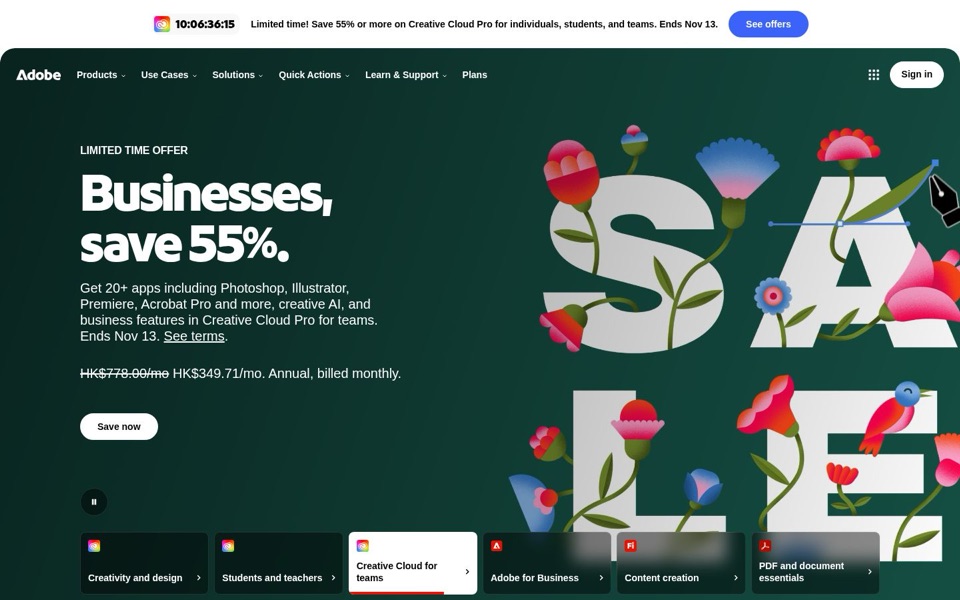
'Businesses, save 55%.' tells a visitor how much they save, but not what they're saving on. The real offer is underneath: 'Photoshop, Illustrator, Premiere, Acrobat Pro and more.' That's the line people recognise, and it's in the smallest text in the section. The headline opens like a letter addressed to every company on earth. It doesn't say why a team should buy now, beyond the date.
Quick win: Put the app names in the headline itself: 'Photoshop, Illustrator, Premiere and Acrobat Pro for your team, now 55% off.'
Call to action
5/10Three buttons, two outfits, one confused visitor.
The bright blue 'See offers' in the top banner is the most eye-catching button on the screen, and it isn't the main one. 'Save now' and 'Sign in' wear the same white pill, like twins who didn't check with each other first, so the button you want clicked looks no more important than signing in. 'Save now' also describes the discount, not the next step, so nobody knows whether it leads to checkout, a plan picker or a sales form.
Quick win: Give 'Save now' the strong blue colour, tone 'Sign in' down to plain text, and relabel it 'See team pricing' or 'Get 55% off'.
Look and layout
7/10Gorgeous artwork, but it's spelling out a word the page already shouted.
The flower-covered 'SALE' letters look great, and the dark green makes the white headline easy to read. But the first screen says 'sale' five ways: a countdown, a banner, 'LIMITED TIME OFFER', '55%', and the giant flower letters. Even the pen tool in the artwork is pointing away from the button. The pause button and the row of six tabs at the bottom (with a red bar filling up under 'Creative Cloud for teams') show this section rotates on its own, so the offer can slide away while someone is still reading the price.
Quick win: Stop the top section from rotating on its own, and let the visitor click the tabs to switch.
Trust and proof
7/10The Adobe name does the heavy lifting. The terms make people hesitate.
Big, familiar app names, a real price with a crossed-out original, a 'See terms' link and an end date all help, and the brand needs no introduction. What slows people down is the price: 'HK$349.71/mo. Annual, billed monthly.' doesn't say whether that's per person or for the team, or what happens after a year. The ticking '10:06:36:15' countdown pushes urgency, but urgency without clear terms reads more like a trap than a deal.
Quick win: Under the price, add one plain line that answers 'per person?' and 'can I cancel?'. Use the wording from your real terms.
Copy
5/10'Annual, billed monthly' is a riddle, not a price.
The paragraph packs 20+ apps, creative AI, business features, a product name and a deadline into one sentence, so nothing stands out. 'Ends Nov 13' appears in both the banner and the paragraph, while the actual billing terms get three clipped words. The banner says 'individuals, students, and teams' and '55% or more', but the headline says only 'Businesses' and '55%'. A visitor has to work out which offer is theirs.
Quick win: Split the paragraph into a short list of what's included, and write the price as a full sentence, for example 'HK$349.71 a month, with a one-year commitment', matched to your real terms.
Mobile
5/10On a phone, the banner eats the first quarter of the screen and the button gets shoved down.
The white countdown banner with 'See offers' fills about the top quarter of the phone screen before the green section even starts. That pushes 'Save now' near the bottom of what a phone shows before scrolling. The headline loses its bold brand lettering and shows in a plain stand-in font, and the flower 'SALE' art drops to the bottom edge, cut off, where only people who scroll will see it. 'Sign in' is a bigger, fatter white pill than 'Save now' and sits right where thumbs rest. One more thing to check: the phone shows won (₩52,100) while the desktop shows Hong Kong dollars. That's probably location, but make sure both show the same deal.
Quick win: Shrink the phone banner to a single line with the countdown inline (or remove it while the main section shows the same offer), and make 'Save now' a full-width blue button.